Whimsical Folk Art Mosaic Landscape for Unique Art Prints
Quick Tip: Click the prompt box above to select it, then press Ctrl+C (Cmd+C on Mac) to copy. Paste directly into Midjourney, DALL-E, or Stable Diffusion!
Why Mosaic Prompts Fail: The Structure-Texture Confusion
The fundamental problem with mosaic prompts in generative AI is that the models have learned "mosaic" as a visual texture category, not a construction method. When you write "mosaic landscape," the AI searches its training for images labeled mosaic—typically photographs of existing mosaics, digital art mimicking mosaic, and occasionally Roman floor fragments. It extracts surface qualities: small squares, color variation, grout lines. But it misses the architectural logic that distinguishes mosaic from pixel art, pointillism, or simply "colorful and fragmented."
This matters because authentic mosaic is defined by how tiles solve representational problems. A mosaic artist cannot blend colors optically like a painter; they must choose discrete tesserae that read as blended from distance. They cannot curve a line smoothly; they must approximate curves through stepped tile placement. These constraints produce distinctive visual rhythms that viewers recognize as "mosaic" even when they cannot articulate why.
The original prompt's "meticulously arranged mosaic fragments" fails precisely here. "Meticulously arranged" describes process, not result. The AI has no training in meticulousness as a visible quality. The improved prompt replaces this with "hand-cut ceramic tiles" and "radial tile patterns"—descriptions of what appears in the final image, not how it was made. This shift from process language to structural language is the single most important technique for successful mosaic prompting.
Building Depth in Tile-Based Compositions
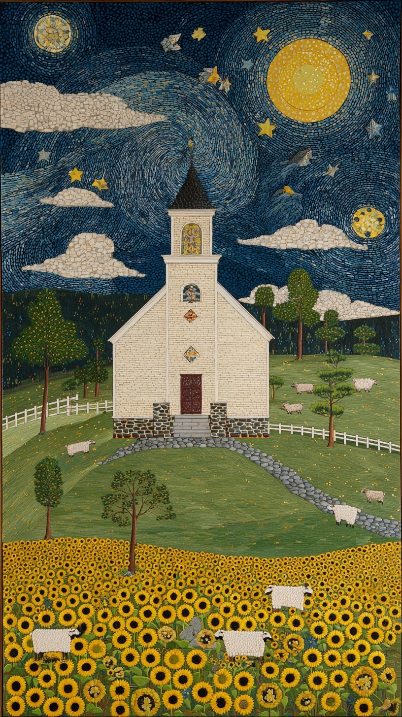
Vertical 9:16 compositions for print require deliberate depth management that flat mosaic traditions often resist. Traditional floor mosaics functioned from a single viewing angle; they could be purely decorative because viewers did not need spatial immersion. A landscape print, however, must guide the eye through distinct spatial planes: foreground sunflowers, middle-ground church and hills, background sky with celestial elements.
The technical solution is hierarchical tile scaling. In the improved prompt, foreground sunflowers use "radial tile patterns"—small tesserae that resolve into individual petals when viewed closely. The moon uses "circular tilework"—larger, more visible units that read as constructed object rather than surface texture. This size variation creates automatic depth: our visual system interprets smaller detail as closer, larger pattern as more distant, even when both occupy the same physical plane in the print.
Color temperature reinforces this hierarchy. The prompt specifies "soft directional moonlight from upper right" with "subtle rim lighting on church facade." This is not atmospheric decoration—it is spatial construction. Cool moonlight (implied by the midnight blue hex values #191970, #0D1B2A) against warm interior glow from stained glass creates the depth cue of illuminated space behind surface. The rim lighting separates the church mass from the hill behind it, preventing the common mosaic failure where all elements read as equally flat.
The Grout Problem: Negative Space as Design Element
Perhaps no single detail distinguishes successful mosaic prompts from failed ones more than the treatment of grout. In physical mosaic, grout lines are not gaps—they are the structural grid that holds the composition together. Their width, color, and pattern create rhythmic intervals that organize the entire image. Yet most AI prompts ignore grout entirely, or mention it as an afterthought.
The original prompt's "glittering glass, weathered stone, hand-cut ceramic" lists materials without addressing how they relate spatially. The improved version adds "visible grout lines" and "intentional grout gaps" because these are not missing details—they are half the visual information in authentic mosaic. Without specified grout, the AI defaults to seamless texture or arbitrary dark lines that do not follow compositional logic.
The color of grout matters technically. Dark grout against light tiles emphasizes the grid structure; light grout against dark tiles dissolves boundaries. The prompt's cream white (#F5F5DC) and umber brown (#6E2C00) palette anticipates this: the white picket fence in "vertical tile strips" will likely read as light tile with dark grout, while the night sky's swirling pattern benefits from dark grout that emphasizes the tile shapes against the deep blue field. This is not aesthetic preference—it is the optical physics of how mosaic functions as a medium.
Print-Ready Technical Specifications
Folk art mosaic landscapes for unique art prints face specific reproduction challenges that digital viewing does not reveal. Tile edges that appear crisp on screen may print as muddy transitions; grout lines visible in digital zoom may disappear entirely at physical print size. The prompt's --s 250 stylization value addresses this directly: lower values (default 100) produce smoother, more "realistic" interpretations that lose tile definition; higher values (750+) introduce decorative artifacts that compromise the folk art authenticity.
The 9:16 aspect ratio at 30-degree elevated perspective is calibrated for standard art print dimensions. A 24×36 inch vertical print maintains readable tile detail in the foreground while allowing the church to function as architectural focal point. Shallower angles force larger prints to maintain detail; steeper angles compress the middle ground into decorative pattern. For smaller prints (11×17, 16×20), consider reducing the sunflower density or increasing tile size specification to prevent detail loss.
Color gamut limitations in print reproduction particularly affect the jewel-toned stained glass windows specified in the prompt. Digital displays can render saturated blues and crimsons that exceed CMYK print gamut. The hex values provided (#922B21 for crimson, #191970 for midnight blue) fall within achievable print ranges, but proofing should verify that the "glittering glass" effect translates—this typically requires metallic ink or spot gloss, which the AI cannot specify but the print workflow must accommodate.
For related approaches to stylized landscape composition, see the technical breakdown of Van Gogh impasto night scenes, which addresses similar challenges of translating painterly texture into reproducible digital art. The watercolor character prompts offer complementary techniques for controlling medium-specific behavior in generative workflows.
External resources on mosaic technique can inform more advanced prompting: the Midjourney documentation provides parameter behavior details, while physical mosaic craft resources clarify the structural logic that distinguishes authentic tilework from decorative fragmentation.
Conclusion
Successful mosaic prompting requires abandoning the vocabulary of effect for the vocabulary of construction. "Whimsical" and "dreamy" describe responses; "radial tile patterns" and "circular tilework" produce them. The AI does not understand atmosphere—it understands geometry, color relationship, and scale. By describing the physical facts of how mosaic is built, you compel the model to render the emotional qualities that attracted you to the medium originally.
Label: Backgrounds
Key Principle: Specify tile architecture, not mosaic effect: describe how tiles construct form (radial, stacked, circular) rather than requesting mosaic style, which the AI interprets as texture rather than structure.