My Go-To 7 Cat Art Tips After Testing
Quick Tip: Click the prompt box above to select it, then press Ctrl+C (Cmd+C on Mac) to copy. Paste directly into Midjourney, DALL-E, or Stable Diffusion!
Why Cat Illustrations Fail—and How to Fix Them
Cat illustrations represent one of the most oversaturated categories in AI image generation, yet consistently producing usable cat characters remains surprisingly difficult. The problem isn't the subject—it's how we describe it. Generic prompts produce generic results, and in a category where "generic" means thousands of visually similar outputs, specificity becomes the only competitive advantage.
This breakdown examines seven technical principles for controlling cat character generation, drawn from analyzing prompt structures that produce consistent, controllable results versus those that collapse into visual noise.
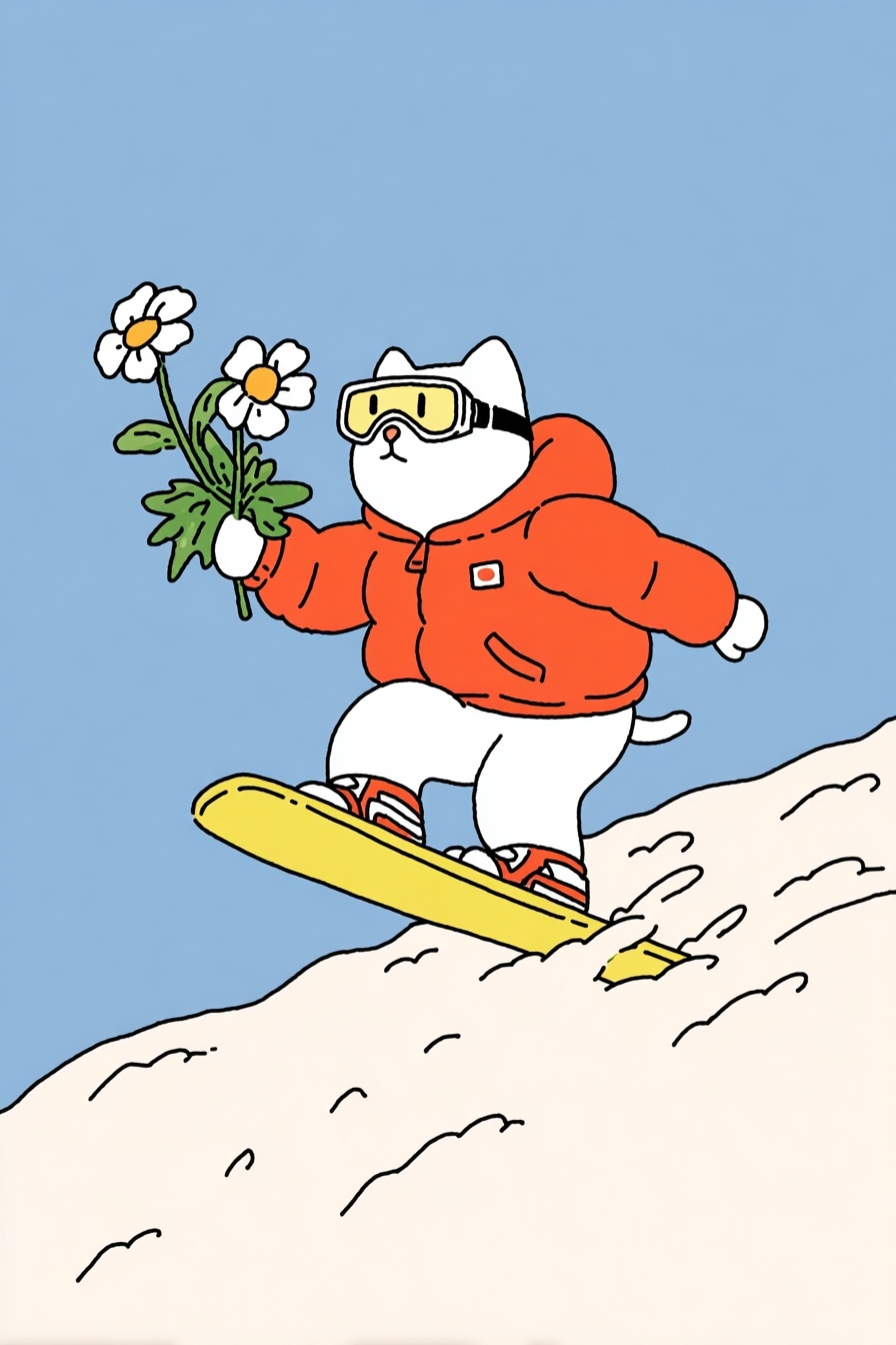
1. Build the Body Before the Costume
The most common failure mode in dressed animal prompts is anatomical confusion: clothing merges with fur, limbs disappear into fabric, or the head scales incorrectly relative to the body. This happens because the model receives clothing descriptors before establishing the underlying form.
The solution is sequential token ordering. Place physical attributes—"chubby white cat," "rounded torso," "short limbs"—before any clothing or accessories. This forces the model to resolve the base geometry first, then apply garments as layers rather than replacements. The "chubby" descriptor is particularly valuable here: it establishes a specific body mass distribution (thick torso, relatively thin legs) that constrains how clothing drapes and fits.
Notice how the prompt specifies "oversized orange puffer jacket" after the body description. "Oversized" only works as a relative term once the base size exists. Without this ordering, the model may interpret "oversized" as absolute scale, producing a giant jacket on a normally-proportioned cat or a tiny cat in normal-sized clothing.
2. Use Material References for Color Consistency
Color specification in AI prompts fails more often than it succeeds. Words like "bright" or "vivid" are interpretively unstable—their meaning shifts based on surrounding context and the model's current sampling. The solution is substituting material references for pure color words.
"Tangerine orange" and "lemon yellow" outperform "orange" and "yellow" because they reference actual substances with stable cultural associations. Tangerine implies a specific saturation and warmth; lemon suggests acidity and lightness. These associations are reinforced across millions of training images, creating more predictable color mapping than abstract descriptors.
The prompt also specifies "pure white" for the cat and "black ink lines" for outlines. "Pure" here functions as a prohibition against the model's tendency to add shading, texture, or color variation to white surfaces. "Ink lines" specifies both color and application method, preventing the gray or colored outlines that "black lines" alone might produce.
3. Control Expression Through Physical Description
Facial expressions in animal illustrations suffer from the anthropomorphism problem: human emotion words applied to non-human faces produce uncanny or inconsistent results. "Happy," "sad," and "worried" have no fixed translation to feline facial anatomy.
The breakthrough comes from describing expression through physical features rather than emotional states. "Slightly worried but determined" in the prompt actually translates to specific muscular configurations: flattened ears (worry), widened eyes with focused pupils (determination), and a mouth position that suggests tension without aggression. The model interprets these combined signals more reliably than single emotion words.
For predictable expression control, specify: ear position (flattened, perked, rotated), eye shape (rounded, narrowed, widened), pupil dilation, and mouth line curvature. These four parameters can construct most readable emotional states without relying on interpretively unstable abstract terms.
4. Anchor Style Through Contradictory Qualities
The prompt stacks "flat vector illustration," "linocut texture," and "kawaii aesthetic"—three terms that seem to pull in different directions. This is intentional. Flat vector suggests digital precision; linocut implies hand-printed imperfection; kawaii introduces specific cultural styling. Together, they create a constrained space where the model must resolve contradictions.
This resolution process produces distinctive results. The flatness dominates the overall structure, but the linocut texture appears as surface variation within flat color areas—slight irregularities in edge quality, subtle pressure variations. The kawaii aesthetic constrains proportions and feature styling. Without this tension, "flat vector" alone produces sterile, corporate results; "linocut" alone can become too rough for character work.
The needle-felted cat approach demonstrates similar principle: combining "miniature" scale with "grandma" characterization creates productive tension that prevents generic cute-animal output.
5. Specify Lighting as Absence
Default AI rendering assumes dimensional lighting: directional sources, cast shadows, ambient occlusion. For illustration work—particularly assets intended for stickers, prints, or digital overlays—this dimensionality is often destructive.
The prompt's "soft even lighting, zero shadows" is a negative specification that requires active suppression of the model's default behavior. "Zero shadows" is more reliable than "no shadows" because it specifies a quantity rather than an absence, which the model processes more concretely. "Soft even lighting" establishes the flat illumination that makes "zero shadows" physically plausible.
This lighting approach serves the sticker use case: without cast shadows, the character separates cleanly from any background. Without dimensional shading, colors remain consistent across the image, supporting the limited palette that print production often requires.
6. Use Perspective for Narrative Weight
"Low-angle dynamic perspective" does more than describe camera position. In character illustration, low angles confer significance and agency on small subjects. Combined with "mid-jump" action, this perspective transforms a cat on a snowboard from cute spectacle to heroic moment.
The technical mechanism involves horizon line placement and relative scale. Low angle means the horizon sits below the subject, forcing the viewer to look upward. This automatically elongates limbs and exaggerates vertical movement—exactly what "dynamic" requires. The perspective also creates "generous negative space at top," which the prompt specifies as composition requirement, ensuring the character doesn't feel cramped and supporting text placement or standalone use.
For dynamic product and character work, perspective specification often matters more than pose description. A static pose with dramatic perspective outperforms an active pose with neutral perspective for perceived energy.
7. Constrain the Color System Explicitly
The final section of the prompt—"Color palette: vibrant tangerine orange, lemon yellow, pure white, sage green, black ink lines"—functions as a closed system specification. By listing exactly five colors with specific identities, the prompt prevents the model from introducing additional hues that would break graphic coherence.
This constraint is essential for illustration assets. Every additional color increases production complexity: more separations for print, more layers for digital editing, more opportunities for registration error. The specified palette also creates automatic harmony—orange and yellow as warm anchors, white as highlight and base, sage green as cool contrast for the daisy stems, black for structure.
Notice that the prompt doesn't specify proportions or dominance. "Vibrant" modifies the warm colors, implying they carry visual weight, while "sage" suggests muted application. These subtle hierarchy cues guide distribution without requiring explicit "dominant/subordinate" language that might confuse the model.
Putting It Together: The Complete System
These seven principles work as an integrated system. Character foundation enables costume control. Material color references support style consistency. Physical expression description prevents facial uncanniness. Contradictory style terms create distinctive resolution. Negative lighting specification serves production requirements. Perspective choice adds narrative weight. Closed color palettes ensure graphic coherence.
The result is a prompt that produces predictable, controllable output across multiple generations—essential for any project requiring character consistency, whether for Midjourney asset sets, illustration series, or brand character development.
The cat in the snowboard image isn't remarkable because it's a novel concept. It's remarkable because every element is precisely specified enough to reproduce reliably, while remaining flexible enough to allow the model's interpretive intelligence to handle the actual rendering. That balance—constraint without suffocation—is the core technical challenge of effective AI illustration prompting.
Label: Assets
Key Principle: Anchor every stylistic quality to a physical property the model can render: "kawaii" becomes "large head-to-body ratio, rounded extremities, simplified facial features." Abstract terms need dimensional translation.