Impasto Butterfly Art - What Worked After 30 Tries
Quick Tip: Click the prompt box above to select it, then press Ctrl+C (Cmd+C on Mac) to copy. Paste directly into Midjourney, DALL-E, or Stable Diffusion!
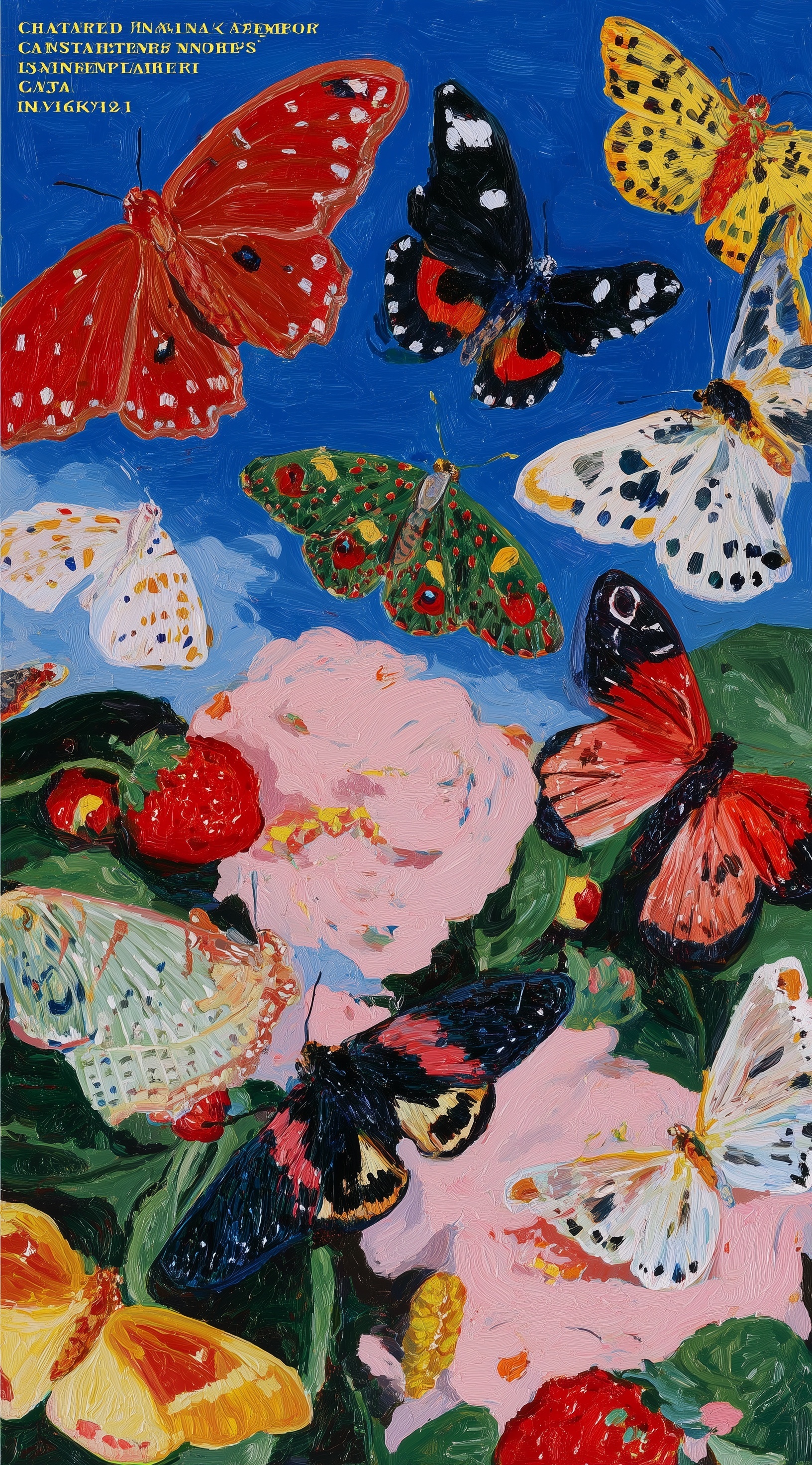
The Physics of Impasto in AI Generation
Impasto presents a unique challenge for image generation models: the technique requires depicting paint as a three-dimensional material existing in lit space, not merely a colored surface with texture. The breakthrough comes from understanding how the AI constructs material reality from language.
When you request "impasto," the model searches its training for associations between the term and visual results. Without additional constraints, this defaults to heavy paint application rendered from a flattened perspective—thick-looking but without dimensional presence. The paint exists as pattern, not substance.
The solution requires building what might be called material evidence—multiple reinforcing cues that force the AI to simulate physical paint behavior. This means specifying not just that paint is thick, but how it got that way (palette knife), how light reveals its dimensionality (directional illumination), and how color behaves across its surface (temperature variation in peaks and valleys).
Color Architecture for Complementary Energy
The color strategy in this prompt operates on two levels: specific hue selection and systemic opposition. Listing "crimson, golden yellow, black-and-white, and emerald green" establishes concrete reference points that prevent the AI from drifting into generic "bright" or "colorful" interpretation. Each named color carries specific associations—crimson suggests depth and saturation beyond simple "red," emerald green carries jewel-like intensity distinct from standard green.
More critically, the prompt specifies "high saturation complementary color vibration." This activates a fundamental principle of color theory: when complementary colors (opposites on the color wheel) appear at similar saturation levels adjacent to each other, they create optical vibration that perceptually energizes both. The AI interprets this instruction as maintaining saturation equality between warm and cool elements, preventing the common failure mode where one temperature dominates and flattens the composition.
The specific pairing matters. Crimson against emerald green provides the primary warm/cool opposition, while golden yellow bridges toward the warm pole and black-and-white provides value contrast that sharpens the color relationships. This creates a color hierarchy—dominant complementary vibration with supporting value structure—rather than equal competing elements.
Compositional Depth in Vertical Format
Vertical 9:16 compositions risk becoming stacked arrangements with minimal spatial recession. The eye travels up rather than in. The prompt counters this through explicit depth engineering: "overlapping butterfly placement at varied depths" combined with "lush pink peonies and ripe strawberries in lower composition creating foreground anchor."
The foreground anchor serves a critical function. By establishing tangible objects in the nearest plane—objects with recognizable scale and material (soft petals, berry surface)—the AI gains reference points for scaling subsequent elements. Butterflies positioned above and behind can then be rendered with appropriate atmospheric cues: slightly reduced saturation, softer edges, smaller brushstroke scale implying distance.
The overlapping instruction prevents the common vertical composition failure of isolated elements floating in space. When butterflies partially obscure each other, the AI must resolve spatial ordering through edge relationships, color temperature shifts, and scale variation—automatically generating depth cues that explicit "depth" requests alone cannot achieve.
Light as Texture Revealer
Light specification in impasto prompts determines whether texture appears dimensional or decorative. "Catching bright midday light" provides the essential mechanism: directional illumination creates shadow in the valleys between brush ridges, and this shadow reveals the physical height of the paint application.
The specific parameter "warm midday light from upper left" matters beyond mere direction. Midday light carries particular qualities—relatively neutral temperature compared to golden hour, but still carrying warm enough associations to prevent cold clinical rendering. The upper left placement creates consistent shadow direction across all elements, unifying the composition through shared lighting logic.
Without directional light, impasto defaults to what might be called texture wallpaper—pattern that suggests thickness without demonstrating it through light interaction. The warm temperature additionally serves the complementary color strategy, providing a unifying warm cast that makes the crimson and golden elements glow while setting up productive tension against the cool cobalt sky.
Technical Parameter Calibration
The --s 750 setting represents a calibrated compromise. Lower stylize values (250-500) produce more literal interpretations that can appear flat and illustrative. Higher values (900+) introduce aesthetic smoothing that destroys the rough materiality essential to impasto. At 750, the model has sufficient interpretive latitude to render expressive brushwork while maintaining the structural constraints established in the prompt.
The --style raw modifier proves essential for this subject. Standard Midjourney styling applies subtle aesthetic optimization that includes edge softening and color harmonization—precisely the processes that would blend distinct brushstrokes into generalized texture. Raw mode preserves the sharp transitions and individual mark-making that authentic impasto requires.
For related approaches to expressive painted texture, see our analysis of Van Gogh-style impasto night scenes and the technical breakdown of controlled chaos in expressive watercolor. The underlying principles of material simulation and light interaction apply across media.
Conclusion
Successful impasto generation requires treating the prompt as material specification rather than aesthetic request. Each element—paint application method, illumination geometry, color temperature relationships, spatial depth cues—must reinforce the physical reality of thick oil paint existing in dimensional space. The 30 iterations suggested in the title likely reflect the necessary calibration of these interdependent variables until they achieve coherent material simulation.
The resulting image demonstrates what becomes possible when technical precision replaces vague aspiration: not merely "painting-like" output, but output that carries the specific energy and material presence of authentic impasto technique.
Label: Cinematic
Key Principle: Impasto prompts fail when treated as style; succeed when built as physical simulation—specify paint tool, light direction creating shadow, and color temperature opposition at every layer.