The Vaporwave Graphics Fix That Saved Me Hours
Quick Tip: Click the prompt box above to select it, then press Ctrl+C (Cmd+C on Mac) to copy. Paste directly into Midjourney, DALL-E, or Stable Diffusion!
The Problem With Vaporwave Prompts
Vaporwave graphics occupy a narrow technical window. The aesthetic emerged from a specific confluence of 1980s consumer culture, early digital imaging limitations, and the ideological reuse of corporate imagery. When Midjourney interprets "vaporwave" without structural guidance, it defaults to the surface signifiers—pink and cyan gradients, palm trees, classical busts—while missing the material conditions that made the original aesthetic legible.
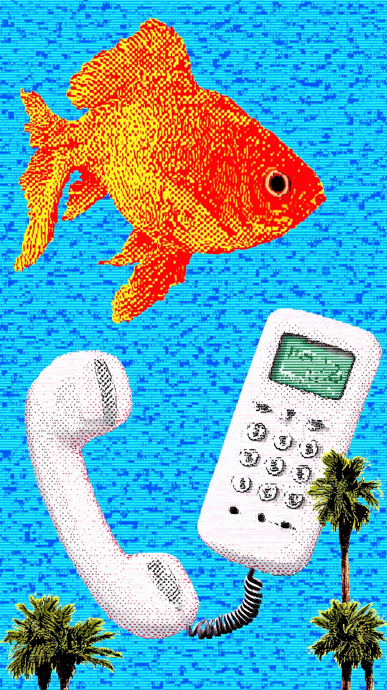
The original prompt in this case produced a competent image, but examine what happens under scrutiny. The goldfish floats. The telephone rests below. The palm trees anchor corners. Yet the image lacks the systematic quality that separates vaporwave from generic retro-futurism. The breakthrough comes from understanding that vaporwave is not a color palette but a display condition—the experience of looking at digital images through the constraints of period hardware.
Consider how CRT displays actually functioned. Phosphor dots arranged in triads produced color through additive mixing. Scanlines appeared because the electron gun drew horizontal lines sequentially, with blank intervals between. Dithering emerged because color depth was limited—16 colors, 256 colors—and smooth gradients required optical mixing of discrete dots. These were not stylistic choices. They were physical necessities that became legible as beauty.
When a prompt omits these material specifications, Midjourney draws from its training data broadly. "Retro" includes film photography, analog video, early CGI, and countless other visual systems. The result dilutes the specificity that makes vaporwave recognizable. The fix requires anchoring every aesthetic claim to a technical mechanism.
Why Dithering Syntax Matters
Dithering is the most misunderstood element of retro digital graphics prompting. Most users request "pixel art" and accept whatever texture emerges. This produces two common failures: either smooth gradients that violate the constraint, or random noise that simulates low quality rather than systematic limitation.
The mechanism matters. Ordered dithering—specifically Bayer dithering—uses predetermined matrices to distribute dots in regular patterns. A 2×2 Bayer matrix creates a simple checkerboard; 4×4 produces the characteristic crosshatch visible in the improved prompt's goldfish scales. This regularity is visually distinctive. It signals intentionality, the mark of graphics designed within severe constraints.
Error diffusion dithering (Floyd-Steinberg, Jarvis-Judice-Ninke) distributes quantization error to neighboring pixels, producing more organic, less regular patterns. This became common in later systems and printing. For authentic 1980s-90s computer graphics, ordered dithering predominates.
The prompt specifies "Bayer dithered scales" and "visible ordered dither pattern" for precise reasons. "Bayer" names the algorithm. "Ordered" distinguishes it from stochastic or error-diffusion alternatives. "Visible" overrides Midjourney's tendency to minimize artifacts that read as defects. Without these layers of specification, the model defaults to whatever dithering produces the smoothest apparent result—usually none, or subtle noise that breaks the retro effect.
The same principle applies to color count. "Limited palette" is too vague. Training data includes 256-color palettes, 4096-color palettes, adaptive palettes, and true-color images with reduced saturation. Specifying "16-color palette" anchors the constraint to the EGA standard, forcing the hard edges and color banding that require dithering as solution. The constraint creates the texture.
Flattening Light, Deepening Time
Midjourney's default lighting model is volumetric and photographic. Light sources have direction, quality, and falloff. Surfaces receive highlights, midtones, and shadows that model three-dimensional form. This is precisely wrong for vaporwave graphics, which derive from screen-based media where light is emitted, not reflected.
The original prompt included "flat high-contrast lighting, zero shadows" but buried these among other specifications. The improved prompt maintains them prominently, and adds "zero shadows" as a distinct clause. This redundancy matters. Shadow suppression requires active override of the model's depth assumptions.
The mechanism: shadows imply a light source outside the image plane, a world with physical depth. Removing them forces the model into a poster logic where value changes indicate graphic boundaries, not form. The goldfish becomes a shape rather than a creature. The telephone becomes an icon rather than an object. This flatness is the essence of early digital graphics, where Z-buffers and normal maps did not exist.
"High-contrast" further reinforces this by eliminating the subtle value gradations that suggest surface curvature. In 8-bit and 16-bit graphics, color indices were too precious for gradual transitions. Edges were sharp. The improved prompt's "high-contrast" declaration prevents the model from softening boundaries in service of perceived realism.
The temporal anchor "CRT scanlines" works similarly. Scanlines are not decorative stripes. They are the physical structure of cathode-ray tube display. Specifying "horizontal CRT scanlines" rather than generic "scanlines" or "scanline effect" signals authentic display technology. Paired with "analog noise" rather than "digital noise," the prompt establishes pre-digital signal conditions—RF interference, broadcast degradation, tape generation loss—rather than contemporary compression artifacts.
Composition as Constraint System
Vaporwave graphics inherit from commercial illustration and early computer art a particular approach to composition: symbolic arrangement rather than perspectival space. Elements float, stack, and juxtapose without environmental coherence. The surrealism is systematic, not arbitrary.
The improved prompt maintains the original's structural elements—goldfish, telephone, palm trees—but the enhanced technical specifications transform how they cohere. With flat lighting and ordered dithering applied consistently, the disparate elements share a unified material condition. They all appear to be displayed on the same screen, subject to the same hardware limitations.
This is the difference between collage and system. Collage combines disparate sources. System creates internal consistency. The palm trees in the corners, the floating goldfish, the grounded telephone—these become legible as a single image when processed through identical display constraints. Without those constraints, they read as awkwardly combined stock elements.
The vertical 9:16 composition reinforces this by referencing phone and monitor orientations, but the deeper fix is in how the prompt constructs visual hierarchy. "Anchoring bottom corners" for the palm trees establishes their role as frame elements. "Floating upside-down" for the goldfish creates surreal disorientation within the systematic flatness. The telephone "below" provides gravitational reference without requiring realistic spatial logic.
Putting It Together
The complete improved prompt demonstrates cumulative specification—each technical term reinforcing the others to create a coherent constraint system. "8-bit pixel art" establishes the domain. "Bayer dithered," "ordered dither pattern," and "16-color palette" specify the color handling. "CRT scanlines" and "analog noise" establish the display condition. "Flat high-contrast lighting" and "zero shadows" override photographic defaults. "Vaporwave aesthetic" can finally function as intended, because the material conditions it references are already established.
This approach eliminates the iteration cycles that consume hours. Without systematic specification, users generate variations hoping for the right combination of retro qualities to emerge. With it, the first generation approaches the target, requiring only minor adjustments to composition or color distribution.
The principle extends beyond vaporwave. Any retro aesthetic—film noir, 1970s documentary, early web design—can be accessed through its material conditions rather than its surface appearance. Identify the technologies that produced the look. Name their specific constraints. The model will assemble the aesthetic from its constituent limitations, producing authenticity that "style of" keywords cannot achieve.
For further exploration of systematic prompting approaches, see how graphic art prompts for screen media establish display-specific constraints, or how pop art prompts leverage printing technology specifications for similar material authenticity. The Midjourney documentation provides additional guidance on parameter behavior, though the systematic approach developed here exceeds their examples in technical specificity.
The vaporwave aesthetic endures because it captures a particular moment of technological transition—the wonder and absurdity of early digital imaging, experienced through the glowing screens of consumer electronics. Prompting it successfully requires honoring that material history, not merely sampling its color palette.
Label: Poster
Key Principle: In pixel art prompts, specify the dithering algorithm and display technology explicitly—"Bayer dither" and "CRT scanlines" outperform generic "retro" by signaling exact graphic systems to the model.