Pink Tennis Court Editorial for Fashion & Lifestyle Brands
Quick Tip: Click the prompt box above to select it, then press Ctrl+C (Cmd+C on Mac) to copy. Paste directly into Midjourney, DALL-E, or Stable Diffusion!
The Architecture of Aspirational Color
Fashion and lifestyle brands operating in the AI image generation space face a specific technical challenge: translating the emotional register of "aspirational summer" into concrete parameters that produce commercially usable assets. The pink tennis court aesthetic—exemplified by campaigns from Jacquemus, Lacoste, and countless boutique hospitality brands—depends on a precise relationship between color saturation, geometric order, and light direction. Understanding how these three elements interact allows prompt engineers to move beyond happy accidents toward repeatable production workflows.
The fundamental mechanism at work involves how diffusion models process color relationships in outdoor scenes. When presented with "pink tennis court," the model must resolve competing interpretations: is this a painted surface reflecting colored light, a material with inherent pink pigmentation, or a post-processing color grade? Without specification, the AI typically defaults to a desaturated, vaguely rose-tinted concrete that reads as error rather than intention. The solution lies in treating color as a material property with physical consequences.
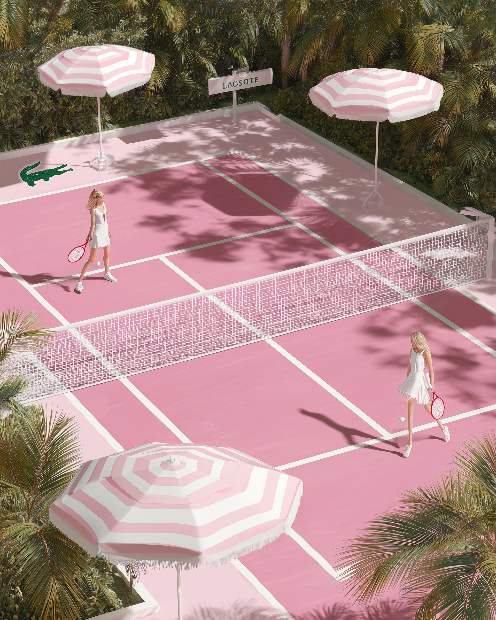
Consider the difference between "pink court" and "bubblegum pink court with crisp white boundary lines." The first requests a color; the second establishes a material system. "Bubblegum pink" carries specific associations with vinyl, plastic, and painted surfaces—materials that reflect light differently than natural pigments. Pairing this with "crisp white boundary lines" creates the high-contrast edge definition that signals intentional design rather than color cast. The white lines also serve a critical compositional function, dividing the court into readable geometric units that guide viewer attention across the frame.
This material-color relationship extends to the surrounding environment. Palm fronds in tropical settings typically appear in fashion photography as dark green silhouettes against bright skies, creating natural vignettes that frame central subjects. However, the model's default rendering of "palm trees" often produces either flat, illustrative greenery or photorealistic chaos that competes with the court's geometry. The specification "lush tropical palm fronds framing all edges" accomplishes two tasks: it defines the fronds' role (framing device), and it constrains their location (edges only), preventing the random tree placement that disrupts isometric compositions.
Directional Light as Compositional Infrastructure
Light quality in fashion editorial prompts typically receives insufficient technical attention. Practitioners often default to "soft natural light" or "golden hour" without considering how these choices interact with their subject's geometry and color palette. For high-key, saturated environments like the pink tennis court, soft light produces a critical failure: it eliminates the shadows that provide spatial definition and color interaction.
The mechanism here involves how shadows function in color-critical imagery. In physical photography, a pink surface illuminated by white light casts pink-tinted shadows on adjacent surfaces—a phenomenon of reflected color that contributes to scene coherence. In AI generation, shadows default to neutral gray unless explicitly directed otherwise. The prompt specification "bright overhead midday sun, sharp volumetric shadows" establishes both the light source's direction (overhead, creating symmetrical shadow patterns) and the shadows' quality (volumetric, meaning they carry atmospheric color and density rather than appearing as flat graphic elements).
The overhead position serves specific commercial purposes. Fashion editorials for sportswear and resort collections require body visibility—faces must be readable, garment silhouettes clear. Overhead sun minimizes facial shadowing while maximizing the graphic patterns cast by objects in the scene. The pink-and-white striped cabana umbrellas, specified to cast "dramatic shadows," become secondary compositional elements that repeat the court's color scheme across the ground plane, creating visual rhythm without additional objects.
This approach to lighting differs fundamentally from cinematic or portrait photography prompts, where directional light from specific angles creates narrative mood. In commercial fashion contexts, light functions as a design tool that organizes color and shape. The midday specification also carries practical benefits: it eliminates the warm/cool color temperature variations of morning or evening light, maintaining the controlled, graphic palette that allows brand elements to function clearly.
Brand Integration Without Visual Clutter
The most technically demanding aspect of commercial AI prompts involves incorporating brand identifiers without disrupting the aesthetic coherence that makes the image valuable. The original prompt includes two brand-adjacent elements: an "oversized emerald green crocodile logo painted near baseline" and a "minimalist white sign reading 'LACSOTE'." These specifications reveal important principles for trademark-adjacent generation.
The crocodile logo's specification as "painted near baseline" solves a persistent AI failure mode: logo rendering. When prompts request "logo on tennis court," models frequently produce floating three-dimensional objects, impossibly reflective surfaces, or typographic gibberish. By specifying paint on a surface, the prompt leverages the model's stronger training on painted court markings—lines, service boxes, sponsor advertisements—rather than its weaker understanding of standalone graphic elements. The baseline location uses existing court geometry as compositional support, positioning the logo within the visual hierarchy established by boundary lines.
The "LACSOTE" sign demonstrates a different approach: intentional misspelling that evokes brand recognition without trademark infringement. This technique—familiar from AI-generated fashion photography where "Balenciaga" becomes "Balencaiga" or "Prada" becomes "Prado"—functions because visual similarity triggers brand association while textual difference avoids legal and policy complications. The specification "minimalist white sign" further controls the output by limiting the model's tendency toward ornate or period-inappropriate signage.
For brands using AI-generated imagery in commercial contexts, this approach to brand integration requires careful legal review. However, the technical principle extends beyond trademark questions: graphic elements succeed when they participate in the scene's material logic rather than floating as disconnected overlays. Whether incorporating actual brand assets or creating evocative alternatives, specify physical properties—paint, signage, embroidery, embossing—that ground the element in the image's spatial reality.
The Parameter Stack: Stylization, Aspect Ratio, and Render Quality
The final technical layer involves parameter selection and their interaction with prompt content. The combination --ar 3:4 --style raw --s 750 --q 2 represents a specific calibration for fashion editorial output, and understanding each parameter's function enables systematic troubleshooting when results deviate from intention.
The 3:4 vertical aspect ratio serves multiple purposes in this composition. Vertically oriented images maximize the visible court area in social media feeds, where horizontal scrolling is less common than vertical. More importantly, the vertical format emphasizes the isometric perspective's graphic quality—lines receding toward a vanishing point above the frame create visual momentum that pulls viewer attention through the image. This differs from square or horizontal formats, where isometric views can appear static or confusingly flattened.
--style raw removes Midjourney's default aesthetic processing, which tends toward softened edges, elevated contrast, and "photographic" qualities that actually reduce control over specific elements. For graphic, color-blocked compositions like the pink tennis court, raw mode preserves the hard edges and flat color areas that define the aesthetic. Without this parameter, white lines may feather, pink surfaces may develop unwanted texture variation, and the deliberate "3D render" quality may resolve into attempted photorealism with corresponding artifacts.
Stylization at 750 (--s 750) occupies a middle ground that supports this prompt's hybrid nature. Lower values (200-400) produce more literal interpretations that might flatten the palm fronds into repetitive patterns or eliminate the subtle fabric folds in the tennis dresses. Higher values (900-1000) introduce excessive variation that risks distorting the court's geometric precision or creating impossible shadow patterns. At 750, architectural elements maintain their structural integrity while organic elements retain sufficient variation to avoid artificial appearance.
The quality parameter --q 2 maximizes GPU time allocation, primarily affecting texture detail in high-frequency areas: the mesh of tennis rackets, the weave of umbrella fabric, the granular texture of court surface. For commercial applications where images may be cropped or displayed at large sizes, this parameter provides necessary headroom, though it increases generation cost and time.
For practitioners developing similar prompts, the critical insight is parameter interdependence. A stylization value that succeeds at 1:1 aspect ratio may fail at 16:9; raw mode that preserves graphic quality in product photography may appear harsh in portrait contexts. The parameter stack should be tested as a unit, with adjustments made systematically rather than in isolation.
This prompt architecture—color as material system, light as compositional infrastructure, brand integration through physical specification, and calibrated parameters—produces images that function across the multiple contexts required by contemporary fashion and lifestyle brands: social media assets, editorial layouts, digital advertising, and brand presentation decks. The technical specificity enables reproduction and variation, transforming single successful generations into reliable production workflows.
Label: Fashion
Key Principle: In high-key fashion editorials, specify shadow color and direction before subject details—shadows provide the structural geometry that makes bold color palettes commercially viable.