Why I Changed How I Do Aerial Surf Shots
Quick Tip: Click the prompt box above to select it, then press Ctrl+C (Cmd+C on Mac) to copy. Paste directly into Midjourney, DALL-E, or Stable Diffusion!
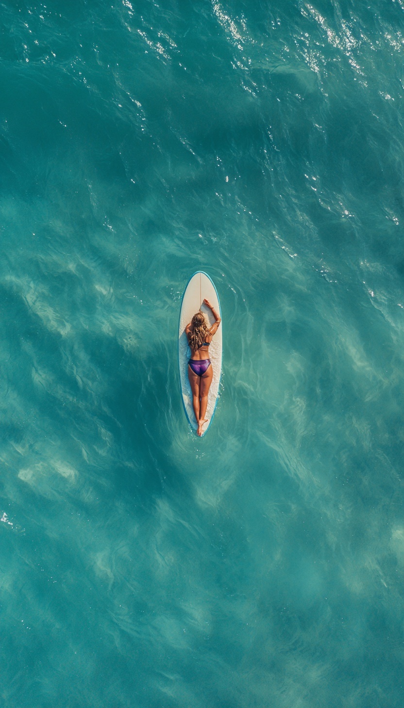
The Problem With "Top-Down" as a Direction
For months, my aerial surf prompts produced images that were almost right — the composition was centered, the colors were vibrant, the subject was recognizable. But they lacked the specific quality that makes drone photography compelling: the collapse of three-dimensional space into abstract pattern. The horizon kept creeping in. The board cast shadows that suggested oblique angles. The water had depth cues — perspective distortion in wave patterns — that betrayed a camera position closer to 60 degrees than true overhead.
The breakthrough came when I stopped using "top-down" as a directional approximation and started treating camera angle as a precise physical parameter. In real drone photography, the difference between 70 degrees and 90 degrees is the difference between aerial photograph and satellite abstraction. At 70 degrees, you see the side of waves, the horizon line, the curvature of the earth. At 90 degrees — true nadir — you see only the surface plane, and water becomes a texture rather than a volume.
Midjourney interprets "top-down" conservatively. The training data contains far more oblique aerial photography (helicopter shots, elevated landscape views) than true nadir drone work. Without explicit constraint, the model drifts toward the more common case. Specifying "85°-90° nadir" or "overhead orthogonal projection" forces the model into the less-represented but optically distinct territory of satellite-view photography. The horizon disappears. The board becomes a white ellipse with only length-width proportions, no perspective foreshortening. The figure becomes a shape in a field.
Building Water That Behaves Like Water
The second failure mode in early prompts was water rendered as color rather than physics. "Turquoise ocean" produces a uniform cyan surface — beautiful, but dead. Real water in overhead sunlight is a complex optical system: it absorbs light selectively by wavelength, scatters photons through suspended particles, reflects the sky in wave facets, and transmits substrate visibility in shallow regions.
The solution requires describing water as a gradient system with explicit depth logic. "Deep teal shadows in wave troughs shifting to aquamarine shallows" establishes chromatic depth — the way water color shifts from dark (more volume, more absorption of red/yellow wavelengths) to light (less volume, more reflection of sand bottom). This isn't aesthetic description; it's optical physics. Deep water appears blue-green because the long wavelengths that would warm it toward turquoise are absorbed. Shallow water appears warmer because sand reflection dominates.
Transparency requires equally specific language. "Visible underwater sand patterns through translucent water" activates the model's understanding of subsurface scattering — the way light penetrates the surface, illuminates the bottom, and returns through the water column with color shift and diffusion. Without this, water becomes opaque paint. With it, the image gains the dimensional depth that sells aerial photography as authentic.
The specular highlight system completes the illusion. Water surfaces are not matte; they're composed of countless tiny mirrors (wave facets) oriented randomly. "Dancing specular highlights on surface ripples" describes the geometric consequence: wherever a wave facet happens to angle toward the sun, a bright point appears. These highlights move in patterns that reveal wave structure beneath. They create the "diamonds on water" effect that distinguishes professional aquatic photography from generic blue backgrounds.
Color Temperature as Grading Anchor
Early attempts at "warm-cool split" grading produced arbitrary results — sometimes orange-teal, sometimes magenta-green, sometimes no split at all. The problem was missing the anchor: color temperature only has meaning relative to a neutral reference. "Warm-cool split" without specified light source temperature gives the model no baseline to push against.
Specifying "harsh midday Mediterranean sun at 5500K" establishes daylight balance as the neutral point. From this anchor, "warm-cool split with teal shadows and amber highlights" becomes legible: shadows push cooler than neutral (toward 6000K+, the teal/cyan range), highlights push warmer (toward 4500K-, the amber/gold range). The 5500K midday sun is critical because it matches the training data association between "harsh" light and neutral-warm color temperature. Dawn or dusk sun (3000K-4000K) would make the same split produce different results — the "cool" shadows might read as neutral blue, the "warm" highlights as orange exaggeration.
This precision matters for the travel editorial aesthetic the prompt targets. Condé Nast photography has a recognizable color signature: saturated but controlled, warm in human elements, cool in environment, with enough contrast to feel immediate but enough shadow detail to feel luxurious. The warm-cool split achieves this by separating subject temperature from environment temperature — the figure reads as alive, sun-warmed, while the water reads as vast, slightly alien, the sublime against the intimate.
Why Cinematic Labeling Matters
The prompt structure borrows from cinematic photography because aerial surf imagery operates in the same register as film: narrative implication without narrative explicitness. The figure paddling becomes a story — anticipation, solitude, the moment before action. The centered composition, extreme angle, and color separation create the same visual tension as an establishing shot in a film where scale dwarfs human presence.
The street portrait approach to environmental storytelling applies here: the subject is small, the frame is large, and meaning emerges from relationship rather than expression. Similarly, techniques from painterly night scenes — the management of light source quality and color temperature — translate directly to water surface management. Both require treating the medium (paint, water) as a light-interaction system rather than a passive background.
For technical reference on how AI models interpret camera and lens specifications, Midjourney's documentation provides useful context on how training data associations affect parameter interpretation.
The Shadow as Proof
The final element that separates authentic aerial photography from generic overhead shots is shadow behavior. In true nadir photography, shadows fall directly beneath objects — minimal displacement, maximum sharpness. "Sharp shadow beneath board" specifies this: the shadow is not elongated (which would indicate oblique sun angle or camera angle), not soft (which would indicate diffusion), but hard-edged and centered.
This shadow serves as optical proof. It confirms the sun position (directly overhead, matching the nadir camera angle). It confirms the light quality (harsh, cloudless). It grounds the figure in the water surface — without it, the board would appear to float. The shadow's color matters too: in the warm-cool split, it falls in the teal shadow range, slightly cooler than the sunlit highlights on the figure's back and hair.
The hair itself becomes a secondary light-interaction system. "Sun-bleached wavy blonde hair fanning in water" specifies color (bleached = high value, low saturation, warm undertone), texture (waves create highlight/shadow micro-patterns), and physical state (floating, not hanging, which requires water contact and implies motion). Each descriptor constrains the model away from generic "blonde hair" toward specific optical behavior.
The result is an image that reads as photographed rather than generated — not because it achieves photorealism in some absolute sense, but because every optical element confirms every other element. The shadow matches the sun. The water color matches the depth. The highlight pattern matches the wave geometry. Coherence, not perfection, is the goal.
Prompt engineering for aerial photography is ultimately the engineering of optical consistency. Each parameter must reference and reinforce the others. The camera angle determines what shadow shape is possible. The sun angle determines what water color is plausible. The color grading determines what emotional register is achieved. Change one without adjusting the others, and the image collapses into the generic — beautiful, perhaps, but not specific. Not convincing. Not the thing itself.
Label: Cinematic
Key Principle: Treat water as a volumetric light medium, not a surface color. Specify optical depth, transparency layers, and specular behavior to escape flat blue rendering.