Vibrant Still Life Product Photography for Healthy Brands
Quick Tip: Click the prompt box above to select it, then press Ctrl+C (Cmd+C on Mac) to copy. Paste directly into Midjourney, DALL-E, or Stable Diffusion!
Why Vertical Stacking Dominates Healthy Brand Photography
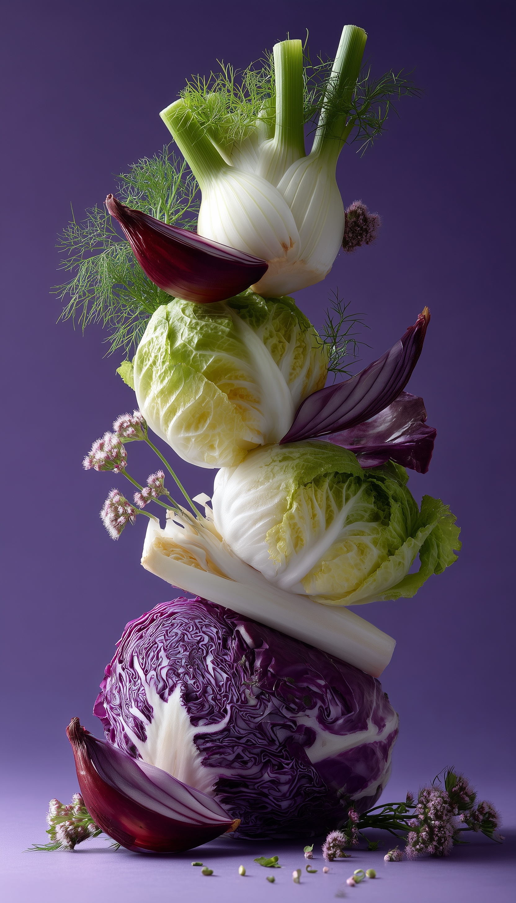
The vertical food tower isn't a stylistic choice—it's a compression of information that solves specific commercial problems. When healthy brands need to communicate variety, freshness, and abundance simultaneously, the horizontal spread becomes wasteful. The vertical stack forces the eye to travel through a narrative sequence: summit (premium ingredient), body (volume and variety), foundation (substance and roots). This mirrors how consumers mentally process health claims—aspirational at the top, grounded in reality at the base.
The mechanism works through visual gravity. Our eyes enter the frame at the brightest point (typically the fennel fronds catching backlight), then descend through the composition, accumulating information. Each layer provides contrast against the next: feathery against solid, pale against saturated, smooth against textured. This rhythm prevents the monotony that kills engagement in single-product shots. For AI generation, specifying "perfect equilibrium" triggers the model to render each contact point with physical plausibility—the leek must actually support the cabbage above, the red cabbage must provide a stable base. Without this instruction, stacks often float or show impossible balancing acts that break commercial credibility.
The Physics of Vegetable Surface Rendering
Fresh produce photography lives or dies at the surface. The original prompt's "hyper-detailed surface textures" request fails because it doesn't specify what surface details matter. Vegetable surfaces aren't uniform—they're cellular architectures with specific optical properties.
Consider the red cabbage half: its cut surface reveals internal veining, a phrase that directs the model toward the branching vascular structures visible in cross-section. Without this, cabbage renders as uniform purple mush. The epidermal cells specification for outer surfaces triggers the subtle bump mapping that separates real produce from plastic imitation. At 8K resolution with proper prompting, these cells become visible as a fine, regular texture that subliminally signals organic authenticity.
Water droplets require equally specific instruction. Generic "water droplets" produce perfect spheres sitting on surfaces—physically implausible on curved, hydrophobic vegetable skin. The caustic highlight addition changes everything: caustics are the bright, focused light patterns created when water refracts illumination. They appear as intense pinpricks or elongated streaks within the droplet, not just white blobs. This optical accuracy separates professional food photography from amateur snapshots. The model needs to know that water on vegetables behaves according to surface tension and contact angles—droplets bead on waxy cabbage leaves, spread on cut surfaces, run in vertical streaks on stalks.
Studio Lighting as Spatial Construction
Commercial food photography lighting isn't about illumination—it's about sculpting three-dimensional space with photons. The prompt's "large softbox" specification, while directionally correct, lacks the precision that controls output quality. A softbox's character changes dramatically with size and distance: a 2-foot box at 3 feet produces harder shadows than a 5-foot box at 6 feet, even at identical exposure. The relative size—source dimension compared to subject dimension—determines shadow quality.
The 5-foot octabox specification serves multiple purposes. The octagonal shape (versus square or rectangular) produces round catchlights in any reflective surfaces—subtly more organic than hard-edged rectangular reflections. At working distance for a vegetable tower, 5 feet provides approximately 180-degree wrap for the tower's vertical dimension, eliminating the multiple-shadow chaos of smaller sources while preserving enough directionality to model form. The 45-degree camera-left position creates the classic "Rembrandt" pattern modified for product: the shadow side receives just enough illumination to maintain detail without flattening.
The fill ratio specification (1:4) completes the spatial construction. In studio terms, this means the key light delivers four times the illuminance of the fill source. Mathematically, that's a 2-stop difference. Practically, it means shadows retain about 25% of highlight brightness—enough to read shape and texture, not so much that dimensionality collapses. The fill card (not a second light, but a reflective surface) preserves the color temperature consistency that multiple sources would complicate. For AI generation, this level of specificity prevents the common failure mode of either flat, shadowless lighting or impenetrable black shadows that obscure product detail.
Color Strategy: Background as Brand Voice
The lavender-purple background carries disproportionate weight in this composition. In healthy brand photography, background color functions as emotional shorthand: white signals clinical purity but risks sterility, green reinforces the product category but creates monotony, warm tones suggest indulgence rather than health. Purple occupies the strategic position of "unexpected premium"—associated with antioxidant-rich foods (berries, red cabbage, eggplant) without literal representation.
The specific RGB anchoring (138, 102, 178) matters because color perception is relative. This value sits at approximately 270 degrees on the hue wheel—squarely in violet territory, avoiding the blue drift that "lavender" often produces. Its saturation level (roughly 35%) provides enough presence to frame the subject without competing for attention. The lightness value (54%) ensures the background reads as deliberate choice rather than underexposure or printing error.
Most critically, this specific purple creates simultaneous contrast with every vegetable in the stack. Against the pale fennel, it intensifies the green-white freshness. Against the red cabbage, it establishes a harmonious analogous relationship that feels designed rather than accidental. Against the crimson onions, it pushes their saturation toward maximum vibrancy through color induction. The model understands these relationships when given exact coordinates; without them, it drifts toward safer, less effective neutrals.
Depth of Field as Information Hierarchy
Shallow depth of field in product photography isn't aesthetic indulgence—it's information management. The human eye can only accommodate one focal plane at a time; photography that respects this limitation feels natural, while all-sharp images feel hyperreal and slightly untrustworthy. The vertical tower composition amplifies this need: without selective focus, the image becomes a catalog illustration rather than a seductive product moment.
The specification strategy here works in two stages. First, anchoring sharpness: "tower razor-sharp" establishes the non-negotiable focal plane. The AI must render cellular detail, water droplets, and surface texture at full resolution here—any softness reads as technical failure or product deficiency. Second, controlled degradation: "foreground blossoms soft circles of confusion" directs the quality of defocus, not just its presence. "Circles of confusion" refers to the optical phenomenon where out-of-focus point sources render as disks—their size and quality indicate lens character and aperture shape. Specifying this prevents the model from rendering defocus as Gaussian blur or directional smear, maintaining the photographic authenticity that sells the commercial intent.
The placement of soft elements matters strategically. Foreground softness (blossoms at the base) creates depth cues that push the product forward—literally bringing it toward the viewer. Background softness would compete with the subject for attention. This configuration mirrors how we physically encounter food: items in hand are sharp, surrounding context recedes. The AI reproduces this spatial psychology when given explicit depth mapping.
For practitioners building similar prompts, the principle extends beyond this specific composition. Any product photography benefits from explicit focal plane specification: "primary subject at maximum sharpness, [specific secondary elements] at [specific blur quality], [tertiary elements] dissolved to color fields." This hierarchy prevents the common failure of AI product images where everything competes equally for attention, resulting in visual noise rather than commercial clarity.
The vertical vegetable tower represents a complete system: color psychology anchored in precise values, spatial construction through physical lighting specifications, surface authenticity via cellular detail, and information hierarchy through controlled depth. Each element reinforces the others. The lavender background makes the vegetables appear fresher; the fresh vegetables justify the premium background; the lighting reveals what the depth of field prioritizes; the depth of field guides attention through what the lighting has revealed. This integration—where technical decisions serve commercial purpose—is what separates effective AI product photography from decorative image generation.
Label: Product
Key Principle: Anchor every color with RGB values and every light with physical source specifications—vague aesthetic language produces vague results, while precise parameters force the model into deliberate, controllable output.