Vibrant Pop Art Cat Portrait for Playful Branding & Decor
Quick Tip: Click the prompt box above to select it, then press Ctrl+C (Cmd+C on Mac) to copy. Paste directly into Midjourney, DALL-E, or Stable Diffusion!
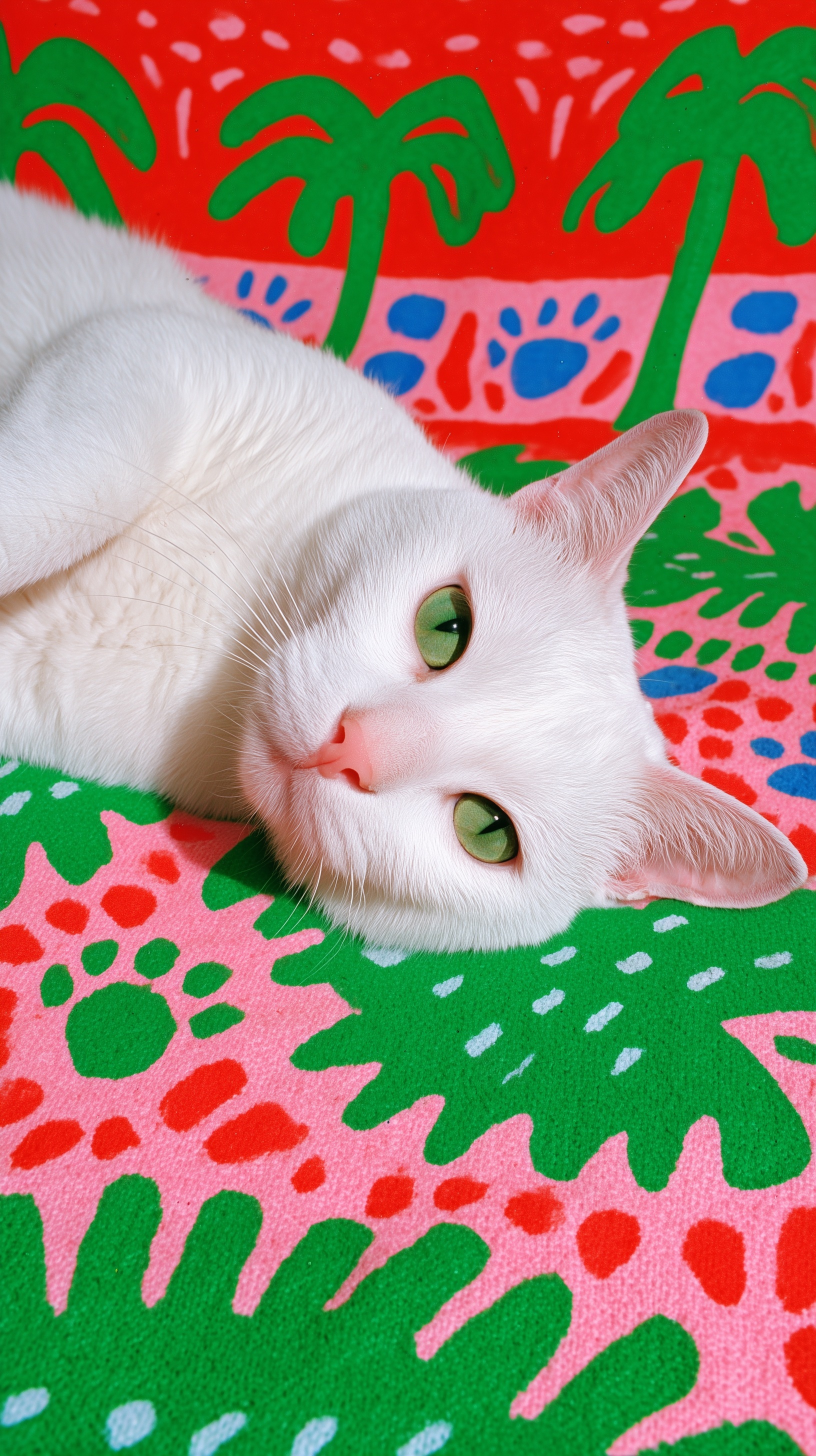
The Physics of Impossible Coexistence
The central technical challenge of this image type is forcing two mutually exclusive visual systems to occupy the same frame without either collapsing. Hyper-realistic pet portraiture depends on subsurface scattering, individual hair dynamics, and millimeter-scale depth variation. Pop art graphics depend on flat color fields, hard edges, and pattern repetition. The AI's default behavior when encountering both is to compromise both—rendering fur that looks slightly illustrated, backgrounds that look slightly photographic, and an overall image that satisfies neither intention.
The solution requires understanding how the model resolves stylistic conflict. When a prompt contains contradictory instructions, Midjourney does not average them—it hierarchizes based on specificity and positional weight. The original prompt's structure placed detailed subject description first, establishing it as primary, then introduced background elements as secondary modifiers. This creates the correct visual hierarchy but doesn't solve the integration problem.
The breakthrough lies in treating the background not as visual information but as environmental physics. The revised prompt specifies "positioned on stylized textile surface"—a simple preposition that transforms the relationship from "subject against background" to "subject within environment." This matters because the model's training data contains vastly more examples of animals on patterned textiles (rugs, blankets, upholstered furniture) than animals floating in front of graphic backdrops. The textile frame activates a familiar physical schema, allowing the stylized pattern to piggyback on established environmental logic.
The "woven fabric with visible fiber structure" specification serves a second function: it provides scale reference. Without material texture, oversized graphic elements lose dimensional anchors—a palm tree pattern could represent anything from a micro-print to a wall mural. The visible fiber structure establishes the weave scale, which in turn calibrates the palm frond size as appropriately oversized for a textile design. This cascade of scale inference happens automatically when material specificity is present, and fails entirely when absent.
Controlling Focal Plane Without Color Collapse
Depth of field in AI image generation follows photographic logic only when explicitly constrained. The standard language—"shallow depth of field," "blurred background," "bokeh"—triggers a default response that includes not only focus falloff but also atmospheric perspective effects: desaturation, cooling, and contrast reduction. These effects are appropriate for distant landscapes but destructive for graphic backgrounds that need to retain chromatic punch.
The mechanism behind this behavior is the model's association between blur and distance. In natural scenes, distant objects are both less sharp and less saturated due to atmospheric haze. The AI applies this correlation automatically unless interrupted. The revised prompt's separation of "losing edge definition" from "retaining color saturation" explicitly breaks this association. It instructs the model to apply optical blur without atmospheric degradation.
The technical specification "90mm macro at 0.8m" reinforces this control with specific optical physics. At this reproduction ratio, a 90mm macro lens produces approximately 2-3cm of depth at f/2.8—enough to hold both eyes sharp while allowing the background textile to fall outside the focal plane. The 0.8m working distance also prevents the facial distortion that occurs at closer macro ranges, maintaining natural feline proportions. Without this distance specification, the AI may default to extreme close-up macro, rendering the nose disproportionately large and the eyes slightly separated in perspective.
The catchlight specification—"positioned at 10 o'clock in both eyes"—completes the lighting logic. Catchlight position signals light source direction, which in turn orients the subject in space. Consistent catchlights across both eyes confirm that the subject is receiving unified environmental lighting, not composite lighting from multiple incompatible sources. This consistency is what separates a coherent portrait from a collage aesthetic.
Color Systems and Anti-Contamination Protocols
Pantone specifications in AI prompts function differently than in print production. The model cannot access Pantone libraries directly; instead, the codes function as compact descriptors of saturated, standardized color that the training data associates with professional design contexts. Their presence signals intentional color curation rather than accidental hue selection.
More critical than the specific codes is the explicit prohibition: "no color bleeding between subject and ground." This addresses a persistent failure mode where vibrant backgrounds contaminate adjacent white or light subjects. The mechanism is the model's tendency toward color harmony—automatically adjusting local colors to create pleasing relationships. Against a tomato-red field, white fur drifts toward pink; against kelly green, toward mint. This reads as environmental color bounce in some contexts, but here it would signal stylistic incoherence, as the pop art graphics are not rendered with realistic light interaction.
The prohibition forces the model to treat the color systems as separate layers that happen to occupy adjacent space, rather than as interacting elements in unified light. This is technically a lie—the fur would realistically reflect some environmental color—but it's a necessary lie to maintain the stylistic conceit of the image. The high-key lighting specification ("large soft source camera-left") provides cover for this separation: in sufficiently bright, diffused light, local color reflection is minimized, and the white fur reads as neutral.
The specific hues selected—sage green for eyes against kelly green background, pink nose against coral pink bands—create near-miss color relationships that vibrate without merging. This is deliberate: identical hues would flatten the subject into the ground, while completely unrelated hues would create discord. The near-misses establish visual rhyme while maintaining separation.
Surface Texture as Believability Engine
The final technical layer addresses what might seem like a minor detail: the woven structure beneath the graphic print. This specification transforms the image from "illustrated cat with pattern behind it" to "photographed cat on physical object." The mechanism is the model's handling of surface detail at different scales.
When a pattern is rendered without substrate texture, it occupies an ambiguous scale. The AI must infer whether this is a wall covering, a fabric print, a digital screen, or something else entirely. Each inference carries different lighting expectations and different relationships to the subject. By specifying "woven fabric with visible fiber structure," the prompt removes this ambiguity and activates a specific material schema with associated physical properties: slight compression under the cat's weight, fiber directionality, light absorption characteristics.
This substrate specificity also enables the depth cue of "reduced scale for depth" in the background continuation. Pattern scale reduction is a standard perspective technique, but it only reads correctly when the surface material is established. Without material grounding, reduced-scale patterns appear as different designs rather than distant continuations of the same surface. The textile substrate provides the continuous physical plane that makes scale variation readable as depth rather than as pattern change.
The resulting image achieves what the original prompt attempted: a collision of incompatible visual languages that somehow holds together. The cat reads as photographically present; the pattern reads as graphically designed; the integration reads as physically plausible. Each of these readings would undermine the others without the precise technical scaffolding that separates and protects each visual system while allowing their coexistence.
For branding and decor applications, this controlled collision offers particular value. The image functions simultaneously as product photography (the cat as subject), graphic design (the pattern as visual system), and emotional communication (the playful tropical energy). Each mode of reading remains available without collapsing into the others—a versatility that depends entirely on the technical precision with which the visual systems were constructed to coexist.
Label: Product
Key Principle: When combining realism with stylized graphics, specify the physical surface relationship and protect color saturation independently from focus—blur degrades edges, not chroma.