Regal Jester Playing Card Art for Fantasy Game Branding
Quick Tip: Click the prompt box above to select it, then press Ctrl+C (Cmd+C on Mac) to copy. Paste directly into Midjourney, DALL-E, or Stable Diffusion!
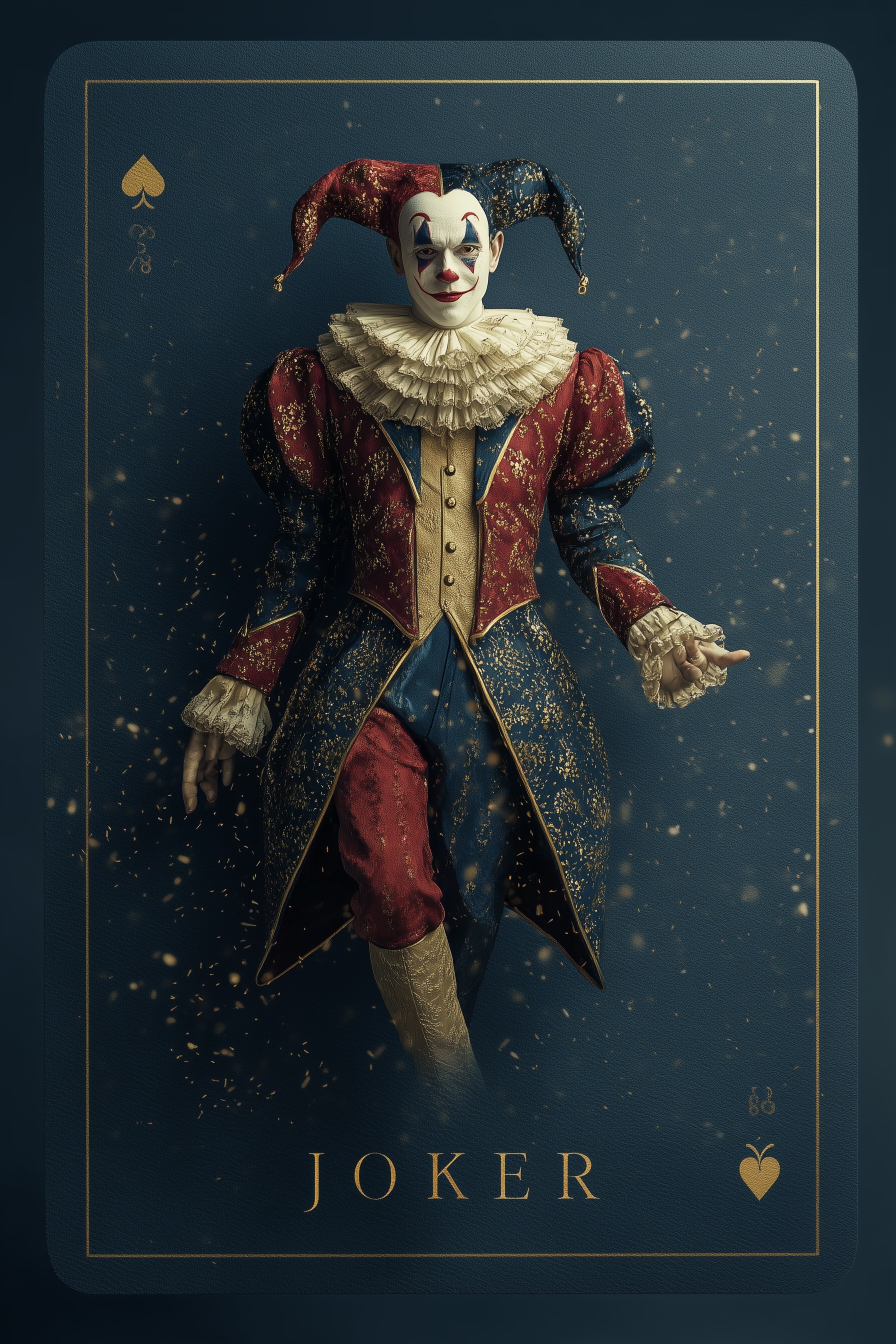
The Physics of Regal Materials in AI Generation
The difference between a convincing aristocratic jester and a costume party reject lies entirely in how you describe light interaction with materials. The original prompt contained the right vocabulary—velvet, brocade, filigree—but lacked the physical specifications that force the model to render them as distinct substances rather than colored shapes.
Velvet presents a particular challenge because its visual identity depends on subsurface light scattering. When photons strike velvet fibers, they penetrate slightly before re-emerging, creating that characteristic depth and color saturation that reads as luxury. Without explicit mention of this behavior, AI defaults to surface shading that flattens velvet into matte plastic. The correction adds "subsurface scattering on velvet"—a rendering term that activates physically-based material systems in the model's training.
Brocade operates on opposite principles. Where velvet absorbs, brocade reflects through its woven relief pattern. The raised metallic threads create specular highlights at specific angles, producing the "heavy gold filigree embroidery catching sharp rim light" specification. This pairs material with lighting condition, forcing the model to calculate reflection geometry rather than painting gold-colored texture.
The rim light itself requires directional commitment. "Dramatic rim light" in the original prompt suggests effect without mechanism. The revision specifies "camera-left" placement, establishing a consistent lighting system that produces predictable shadows and highlights. This matters for asset consistency—if you're generating multiple court cards, they must share the same lighting environment to function as a set.
Symmetry Systems for Brand Recognition
Playing cards depend on instant visual parsing. The human visual system recognizes symmetrical patterns in approximately 150 milliseconds, making vertical split construction the most efficient path to "jester identification." The original prompt's "split-tone costume" leaves division geometry undefined, permitting diagonal splits, irregular patches, or worst-case scenario: gradients that read as neither one color nor two.
The technical solution employs explicit spatial partitioning: "precise vertical split," "left half/right half," or percentage-based division. This mirrors heraldic tradition where color fields communicate identity through position as much as hue. The crimson/royal blue pairing specifically references European court jester traditions while providing sufficient contrast for accessibility.
The hat extends this system through "mirroring costume split"—ensuring visual coherence rather than random color assignment. Without this parameter, AI tends toward independent color choices for headwear that break the unified design system. The gold bells receive "motion blur" specification, introducing temporal dimension to static image through implied movement.
Related techniques for maintaining visual systems appear in cinematic card design, where consistent lighting and material language across multiple assets creates collectible coherence.
Typography as Comitional Architecture
The most common failure in AI card generation occurs at the typography. "Elegant gold JOKER lettering at base" describes aesthetic aspiration without structural constraint. The result: floating letterforms with inconsistent weight, improper spacing, and no relationship to surrounding elements.
The revision treats typography as integrated architectural element: "elegant gold JOKER lettering integrated at base with proper kerning." The kerning specification specifically addresses character spacing—a detail that separates professional from amateur output. Without it, letters cluster or drift independently, producing the approximate legibility of hand-painted signage rather than precision manufacturing.
The specification continues with "matching gold border weight"—establishing visual rhythm between frame and typography. This creates the hierarchical relationship essential for game assets: figure primary, type secondary, decorative elements supporting. The vintage serif style reference anchors historical period, preventing anachronistic sans-serif intrusions that break fantasy immersion.
Corner symbols require similar precision. "Vintage spade and heart suit symbols in opposing corners" specifies both style and placement, ensuring balanced compositional weight. The opposing placement creates diagonal visual tension that stabilizes the centered figure.
Volumetric Atmosphere and Depth Cueing
The "golden particulate matter suspended in volumetric haze" parameter serves multiple technical functions. First, it establishes atmospheric perspective—particles closer to camera appear larger and more distinct, creating depth planes that separate figure from background. Second, it provides light interaction medium, allowing light beams to become visible through scattering rather than remaining abstract.
The original's "Rembrandt lighting sculpting every fold and thread" combines style reference with function. Rembrandt lighting specifically denotes 45-degree key placement with triangular highlight on shadow-side cheek—a pattern that models three-dimensional form through controlled shadow. However, the revision clarifies this as "Rembrandt lighting at 45-degree key angle," removing interpretive ambiguity.
The 9:16 aspect ratio selection deserves explicit justification. Vertical orientation accommodates full-body presentation while maintaining card-proportional aesthetics. The narrow width forces compositional discipline—every horizontal element must earn its place—while the height permits dramatic vertical staging from ruffled collar to presenting hand gesture.
For additional exploration of vertical composition in branded assets, see porcelain material rendering techniques that share similar subsurface scattering requirements.
Asset System Consistency
The final parameter—"branded asset composition"—signals intended use context to the model. This triggers compositional habits from commercial illustration training: centered subject weight, corner-safe negative space for variable cropping, and detail density that maintains legibility at thumbnail scale.
Fantasy game branding requires assets that function across contexts: full card art, inventory icons, promotional banners, physical merchandise. The specifications here—predictable lighting, defined material behavior, integrated typography—create the modular consistency that makes multi-platform deployment possible without manual revision.
The "photorealistic digital painting" medium specification bridges rendering accuracy with artistic interpretation. Pure photorealism risks uncanny valley effects in fantastical subjects; pure illustration loses material credibility. The hybrid approach permits accurate velvet and gold rendering while maintaining stylized proportion and composition appropriate to game aesthetics.
Platform-specific optimization remains relevant for deployment. While Midjourney produces the source assets described here, downstream processing in dedicated image tools may address resolution, format conversion, or platform-specific compression requirements.
The complete prompt structure—material physics, lighting system, spatial organization, typographic integration, and use-context signaling—demonstrates how technical specificity produces commercially viable output. Each parameter addresses a specific failure mode, building redundancy against the interpretive variance inherent to generative systems.
Label: Branding
Key Principle: Treat every material as a lighting problem: velvet needs subsurface scattering, gold needs incident angle, brocade needs scale-appropriate pattern density. Specify the physics, not just the appearance.