Why I Started Using Motion Blur Differently
Quick Tip: Click the prompt box above to select it, then press Ctrl+C (Cmd+C on Mac) to copy. Paste directly into Midjourney, DALL-E, or Stable Diffusion!
The Problem With "Motion Blur" as a Generic Request
Most AI-generated images fail at motion because the request treats blur as an aesthetic filter rather than a physical consequence of time, light, and movement. When you write "motion blur" without specificity, the model has no mechanism to determine what moves, how it moves, and what remains stable as reference. The result is either a uniformly smeared subject that looks like camera shake, or selective blur applied with no physical logic—legs sharp while the tail blurs, or background elements streaking while the subject freezes in ways that violate actual physics.
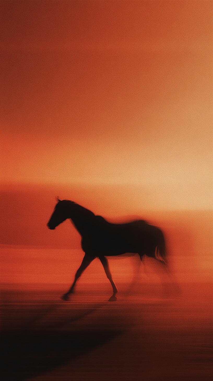
The breakthrough comes from understanding how real cameras capture motion. A long exposure doesn't simply "add blur"—it accumulates photons over time, meaning any light source or reflective surface traces its path through the frame while static elements remain fixed. In the horse image, this principle manifests in the separation between the sharp silhouette (stable mass) and the streaked extremities (moving elements). The torso doesn't move relative to the frame during the exposure; the legs cycle through positions, creating composite trails. Without articulating this relationship, the AI defaults to either full sharpness or full abstraction.
Directional Vectors: The Physics of Selective Blur
Motion in three-dimensional space resolves into vectors. A galloping horse's hooves move primarily in the horizontal plane—forward and backward relative to the body—while the mane responds to wind resistance and inertia, creating vertical or diagonal trails. The original prompt's "horizontal velocity lines where hooves meet dusty ground" and "liquid trails of movement" in the mane encode this vector separation explicitly.
Why this matters technically: the AI's diffusion process samples from training images where motion blur correlates with specific edge orientations. When you specify "horizontal streaks," you activate the model's learned association between horizontal edge smearing and ground-parallel movement. "Vertical liquid trails" trigger different sampling patterns associated with hair, fabric, and fluid dynamics under vertical force. Generic "motion blur" provides no directional signal, so the model averages across all possibilities, producing the muddy, non-directional smear that reads as digital artifact rather than photographic technique.
The low three-quarter angle reinforces this vector logic. Shot from below, the horse's horizontal movement across the frame becomes more pronounced—the legs sweep through a larger apparent arc relative to the camera position. A straight side profile would compress this motion into a thinner visual plane; the three-quarter view expands the available space for blur trails to register. This isn't compositional preference alone—it's geometric optimization for motion visibility.
Silhouette as Motion Anchor
The silhouette form solves a critical problem in motion photography: how to maintain subject readability while surrounding it with blur. A fully rendered horse—with visible musculature, eye detail, coat texture—would compete visually with its own motion trails. The eye would struggle to determine whether the blur represents movement or failed focus on detailed surfaces.
By crushing to pure black, the silhouette becomes a shape rather than a surface. The brain processes shape recognition faster and more reliably than surface detail, especially when that shape contains no internal texture to misinterpret. The "crushed blacks" parameter isn't merely contrast adjustment—it's cognitive load reduction. The viewer instantly understands "horse" from outline alone, freeing attention to appreciate the motion trails as intentional effect rather than technical error.
The backlighting through "atmospheric haze" serves a similar anchoring function. The gradient sky provides a smooth, texture-free backdrop against which the silhouette and its motion trails achieve maximum separation. Busy backgrounds—cloud detail, landscape elements, color variation—would create competing edges that fragment the blur trails into visual noise. The "nuclear orange and smoldering crimson" gradient functions as a neutral field optimized for silhouette legibility.
Film Grain as Temporal Texture
The "35mm Kodachrome color science" and "heavy film grain texture" parameters address a subtle but crucial distinction: analog motion blur differs from digital motion blur in its noise characteristics. Digital sensors produce clean, consistent blur where each frame transition blends smoothly. Film captures motion through mechanical shutter and chemical response, introducing micro-variations—grain clumping in shadows, highlight halation, color channel misregistration—that signal "authentic" motion photography to trained visual perception.
Kodachrome specifically offers distinctive properties: extremely fine grain structure in midtones, aggressive grain clumping in shadows, and highlight compression that rolls off to white rather than clipping abruptly. These characteristics matter for motion blur because they determine how moving edges transition. A digital blur edge is mathematically smooth; a Kodachrome blur edge carries the film's characteristic texture, making the motion feel "captured" rather than "rendered."
The "blown highlights at the horizon" parameter risks technical inaccuracy—Kodachrome actually resists highlight blowout through its dye-coupler chemistry. The improved prompt substitutes "subtle highlight compression," which more accurately describes the film's response while maintaining the emotional quality of intense backlight. This distinction matters because the AI's training data includes enough technical photography knowledge that inaccurate film descriptions may trigger conflicting sampling patterns.
Positioning and Scale: The 9:16 Vertical Frame
The vertical 9:16 aspect ratio isn't merely mobile-optimized composition—it enables specific motion dynamics unavailable in horizontal formats. A galloping horse in a wide frame would exit the composition quickly, requiring either cramped framing or reduced scale. The vertical frame accommodates the full body length while allowing generous space above and below for motion trails to extend without truncation.
The "left of center" positioning creates diagonal tension through the frame. The horse moves toward frame right, but its placement on the left generates a trailing space that the motion blur visually fills. Centered composition would trap the blur symmetrically, reducing directional energy. Extreme edge placement would compress the blur into the frame edge. The rule-of-thirds intersection provides optimal balance between subject presence and motion trail expansion.
The scale relationship between horse and frame also enables the "low angle" to function effectively. Shot from below at this vertical proportion, the horse acquires monumentality—its legs extend toward the lower frame edge, their blur trails reaching the bottom boundary and implying continuation beyond the visible. The sky dominates the upper two-thirds, providing the color field that makes the silhouette and its motion trails visible. A horizontal frame would distribute these elements differently, likely sacrificing either the sky's color gradient or the ground-level blur dynamics.
Conclusion
Motion blur in AI image generation succeeds when treated as a physical system rather than a stylistic overlay. The improved prompt structure—vector-specific blur directions, silhouette anchoring, film-specific texture, and frame-optimized composition—produces images where motion reads as captured phenomenon rather than applied effect. The technical specificity doesn't constrain creativity; it channels the model's sampling toward coherent physical outcomes. The result is imagery that satisfies both emotional intent and perceptual logic, the blur serving narrative rather than obscuring it.
Label: Cinematic
Key Principle: Treat motion blur as selective focal points with directional logic: anchor your subject's core mass in sharp focus while specifying exact vectors for trailing elements, matching physical movement patterns rather than applying uniform effects.