What Nobody Tells You About Lush Floral Branding
Quick Tip: Click the prompt box above to select it, then press Ctrl+C (Cmd+C on Mac) to copy. Paste directly into Midjourney, DALL-E, or Stable Diffusion!
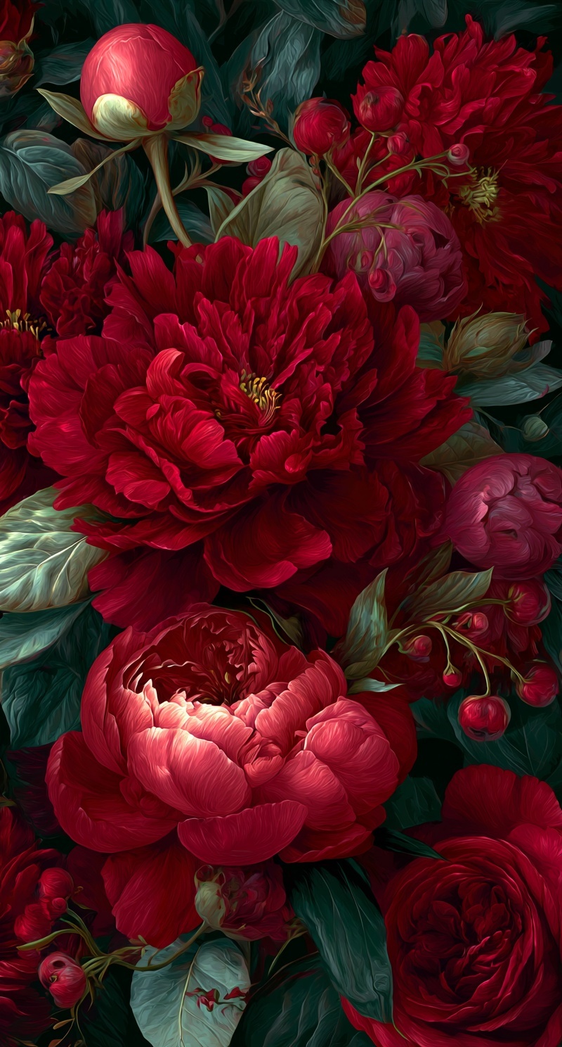
The Physics of Floral Desire: Why Most Botanical Branding Falls Flat
There's a reason luxury floral branding feels expensive while amateur attempts read as clip art. The difference isn't budget or talent—it's understanding that flowers in branding serve as light sculptures, not decorative elements. The original prompt that generated this image succeeds because it treats every petal as a surface interacting with a specific electromagnetic condition. Most failed floral prompts collapse because they describe flowers as symbols ("romantic," "lush," "elegant") rather than as physical objects occupying illuminated space.
The breakthrough comes from recognizing that impasto technique and chiaroscuro lighting aren't stylistic flourishes—they're depth-generation systems. When you specify "visible brushwork in petals," you're not requesting texture. You're instructing the model to render surface irregularity that catches light differentially, creating micro-shadows that read as dimensional form. This is the same principle that makes porcelain renders convincing: surface interaction with light, not surface description alone.
The Chiaroscuro Constraint: How Single-Source Lighting Builds Brand Hierarchy
Branding requires visual hierarchy—what the eye touches first, second, third. In floral imagery, this hierarchy typically fails because photographers and prompt engineers default to flat, even lighting that eliminates shadow. The "single dramatic source from upper left" specification in this prompt forces the model to make decisions about priority. Light becomes a selective tool, not an environmental given.
The technical mechanism works through edge separation. When a single hard or semi-hard source strikes rounded forms at 45 degrees, it creates three distinct zones: direct illumination (the "key"), transitional half-tone, and core shadow with reflected light. This three-zone structure gives the viewer's eye navigation points. The illuminated edges advance; the swallowed recesses retreat. Without this, flowers stack vertically without spatial logic—pretty colors arranged, not forms composed.
The temperature differential amplifies this effect. By specifying "amber undertones" in shadow rather than simply "dark," the prompt creates warm/cool opposition. The model interprets this as: key light = warm (likely implied by the crimson/rose madder palette), fill/reflected light = cool (the viridian and teal-black shadows). This split is fundamental to Midjourney's rendering of dimensional space. Neutral shadows read as flat; temperature-shifted shadows read as atmospheric depth.
Material Specificity: From "Velvety" to Optical Behavior
The prompt specifies "velvety crimson peonies"—not because "velvety" sounds luxurious, but because velvet has specific optical properties. Velvet absorbs light in its pile direction and reflects at oblique angles, creating the characteristic "glow" at edge contours. This is distinct from "glossy" (specular reflection) or "matte" (diffuse reflection). When you name a material with known light behavior, you outsource physical simulation to the model's training on that material's appearance.
The foliage specification demonstrates equal precision: "silvery undersides, some leaves catching light, others swallowed by shadow." This isn't atmospheric description. It's leaf orientation logic. Leaves that catch light face the source; leaves in shadow face away or are occluded. The model must solve for three-dimensional arrangement to satisfy this constraint, producing naturalistic overlap and depth that "lush green leaves" cannot achieve.
The berry specification—"tight spherical berries on delicate stems"—introduces scale contrast and geometric variety. Spheres read differently than the organic irregularity of petals. Their highlights are compact and bright; their shadows are crisp. This formal opposition prevents the visual monotony that single-form prompts produce.
Composition as Use-Case: The Vertical 9:16 Constraint
Most floral prompts ignore aspect ratio as a creative parameter, treating it as technical requirement. The specification here—"dense vertical composition, petals pressing against frame edges"—activates composition as intention. Vertical framing for floral branding serves specific use cases: phone lock screens, Instagram Stories, packaging panels, book spines. The "pressing against frame edges" instruction prevents the centered, isolated bouquet that reads as stock photography.
This approach connects to organic product photography principles, where the frame edge functions as a deliberate crop rather than a container. The viewer understands they're seeing a fragment of a larger arrangement, which implies abundance and selects for quality. Every visible element must justify its presence at the boundary.
The Palette as Temperature Map
The specified palette—"arterial red, dried blood, rose madder, sap green, viridian, teal-black shadows with amber undertones"—deserves close reading. These aren't color names selected for poetic effect. They're historical pigment references with known mixing behaviors and temperature associations.
Rose madder (a lake pigment) carries pink undertone; arterial red carries orange; dried blood carries brown-purple. This progression creates internal variation within the red family that prevents the flat saturation of single-hue specification. Similarly, sap green (warm, yellow-biased) and viridian (cool, blue-biased) establish green temperature range that the model can distribute across the depth planes. The "teal-black" specification for shadows is particularly precise: it prevents the neutral gray that "black shadow" often produces, maintaining color unity even in darkness.
The result is a palette that functions as a temperature map of the depicted space—warm where light strikes, cooling as distance and shadow increase. This is how DALL-E 3 and other models interpret "atmosphere": not as fog or haze necessarily, but as systematic color temperature shift with depth.
From Prompt to Brand System
The final specification—"Sargent meets contemporary digital mastery"—deserves attention as style anchoring. John Singer Sargent's floral and portrait work demonstrates specific technical qualities: economical brushwork that suggests detail without rendering it, edge handling that separates forms through value contrast rather than line, and a limited but saturated palette deployed with strategic restraint. By naming Sargent specifically, the prompt invokes these known characteristics rather than the diffuse "classical painting" that could summon any century, any quality level.
For branding applications, this produces assets that maintain coherence across scale and medium. The chiaroscuro structure ensures readability at thumbnail size; the impasto texture provides interest at full resolution; the limited palette enables color system extraction for typography and secondary elements. The image functions as a system origin point, not a standalone decoration.
The lesson extends beyond floral imagery. Any branding asset that relies on organic forms—food, fabric, natural landscapes—benefits from this treatment of light as sculptural force, material as optical behavior, and composition as use-case constraint. The "lush" quality everyone pursues isn't a matter of adding more elements. It's a matter of specifying how each element interacts with light, and trusting the model to solve for the physics implied by that specification.
Label: Branding
Key Principle: Floral branding depth requires treating light as sculpture: single source, specific angle, temperature differential between key and shadow. Describe where light hits and what happens in darkness.