Impasto Kingfisher Art for Elegant Wall Decor & Branding
Quick Tip: Click the prompt box above to select it, then press Ctrl+C (Cmd+C on Mac) to copy. Paste directly into Midjourney, DALL-E, or Stable Diffusion!
Why Impasto Commands Premium Positioning in Visual Branding
Impasto technique occupies a unique position in commercial visual culture because it carries automatic associations of material investment and human agency. Unlike flat digital illustration or photographic capture, heavy impasto signals time, physical material, and irreproducible gesture. For brands targeting luxury interiors, artisanal positioning, or heritage credibility, this technique provides instant texture differentiation in saturated markets.
The technical challenge lies in translating physical paint behavior into generative prompts. The model has no tactile experience of viscosity or resistance. It knows impasto as visual correlation patterns — associations between certain descriptors and certain image outcomes. Your task is to construct a prompt that reverse-engineers the physical conditions that produce authentic impasto appearance.
The Physics of Paint: Building Dimension Through Light
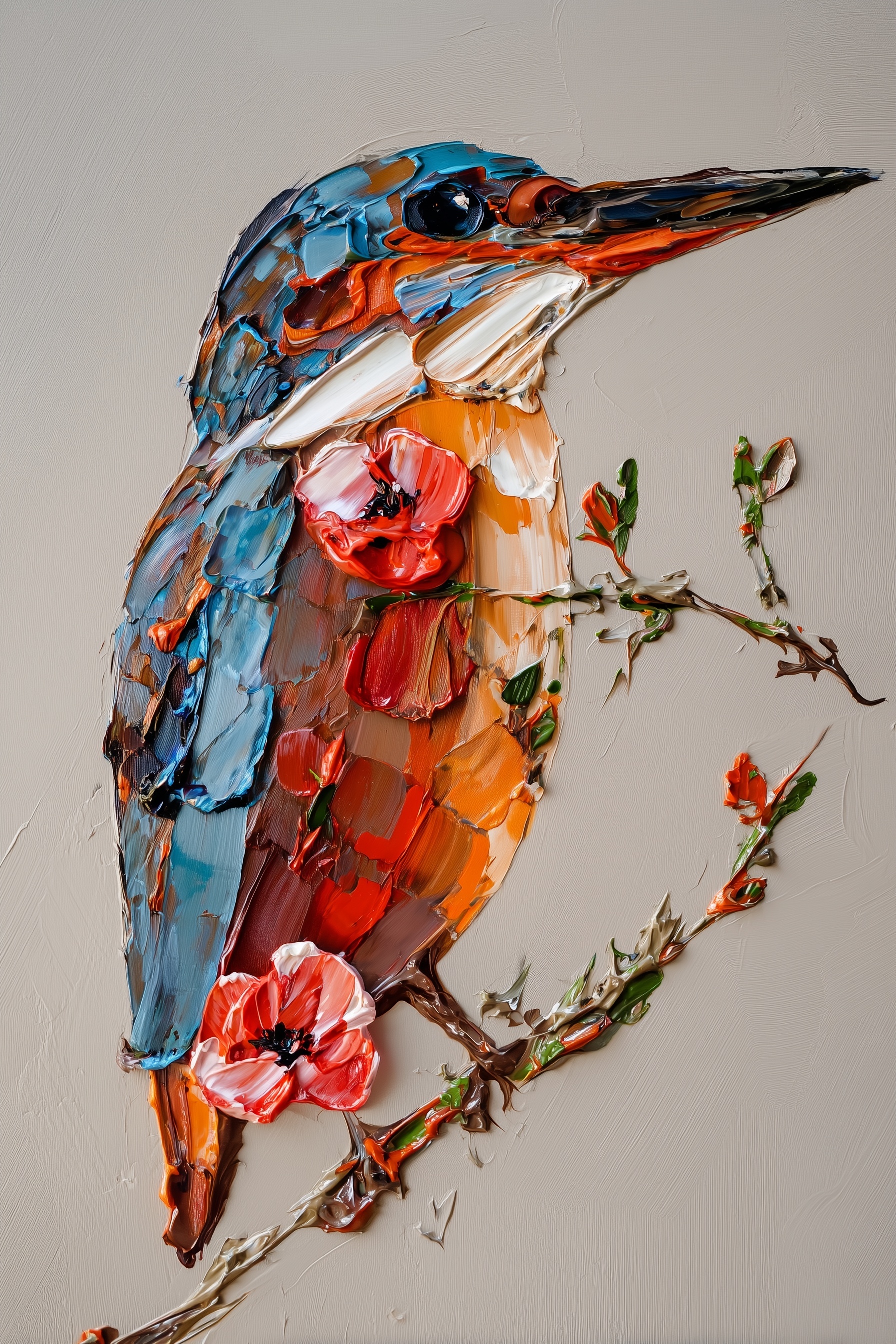
Real impasto creates actual topography. A palette knife deposits ridges that cast micro-shadows; brush hairs drag furrows that catch light differently than surrounding peaks. This dimensional variation is what separates genuine impasto from the "painterly filter" look that disappoints in commercial applications.
The breakthrough comes in recognizing that impasto must be lit to exist. Without directional light, thick paint reads as flat color with irregular edges. The solution is specifying raking light — illumination that skims across the surface at a shallow angle, typically 30-45 degrees from the picture plane. This angle maximizes the shadow-to-height ratio, making 3-4mm ridges register as significant terrain.
Consider the mechanism: when light strikes a paint ridge perpendicular to the surface, the shadow falls directly behind and is largely invisible. At 45 degrees, the same ridge casts a shadow equal to its height, doubling the apparent dimensionality. At grazing angles below 30 degrees, shadows extend too far and create excessive contrast that fragments the image. The 45-degree specification in the prompt is not arbitrary aesthetic preference but optical physics.
The specular highlight requirement serves equally critical function. Oil paint at impasto thickness has sufficient binder to create glossy peaks where light reflects directly. These highlights provide the "wet paint" signal that distinguishes fresh, substantial application from dry, aged surfaces. Without explicit mention, the model defaults to matte interpretation, producing the chalky appearance associated with student-grade materials.
Color Strategy: Pigment as Material, Not Decoration
Impasto color mixing operates through optical rather than physical blending. A blue ridge beside an orange ridge creates vibration at their boundary without either hue being compromised. This optical mixing preserves saturation impossible with blended pigments, which darken toward neutral.
The prompt's pigment specification — ultramarine, vermillion, cadmium orange deep — serves dual function. First, these are historically accurate oil pigments with established handling characteristics: ultramarine's granular transparency, vermillion's dense opacity, cadmium's buttery body. The model's training associates these terms with specific visual behaviors. Second, the limited palette forces color harmony through restriction rather than instruction. Five pigments, strategically placed, produce more coherent results than "vibrant colors" which the model interprets as unconstrained hue variation.
The anatomical mapping matters equally. Kingfishers carry specific color architecture: blue dorsal surfaces, orange ventral, white throat patch. Assigning pigments to these regions prevents the common failure of "blue and orange bird" where hues migrate across feather groups. The white throat requires explicit mention — without it, the model may extend orange into the neck, breaking species recognition and compositional rhythm.
For branding applications, this color discipline enables versatile extraction. The cobalt-against-greige combination functions at thumbnail scale; the full palette maintains impact at wall size. The white throat provides natural focal point for logo adaptation. Each color decision anticipates downstream use.
Composition for Commercial Adaptability
The left-third placement with rightward beak extension solves problems that centered compositions create for commercial deployment. Consider the typical adaptation path: a vertical 2:3 image must become horizontal banner, square social post, and circular profile element.
Centered subjects force cropping decisions that sacrifice critical elements. The offset position creates protective negative space — areas that can be trimmed without affecting the subject. The diagonal tension from beak to frame edge maintains visual interest in horizontal crops that would make centered subjects appear stranded.
This approach differs fundamentally from "rule of thirds" applied as placement formula. The critical element is not the bird's position but the directional vector it establishes. The beak extension creates implied motion that activates the empty space, transforming it from absence into compositional participant. For wall decor, this creates breathing room; for branding, it accommodates text lockups; for social media, it survives platform-imposed cropping.
The vertical 2:3 ratio itself deserves consideration. While 16:9 dominates screen experience, vertical formats command attention in mobile scrolling and print applications (magazine covers, book spines, packaging). For luxury positioning, vertical suggests aspiration and elevation; horizontal suggests narrative and context. The choice aligns with wall art destination.
Background as Active Design Element
Warm greige — the specific neutral between gray and beige — performs technical work beyond aesthetic preference. Against cobalt blue, it provides sufficient value contrast without complementary vibration. Against burnt orange, it maintains separation without temperature competition. The subtle canvas weave signals "painting" without introducing pattern that would compete with the impasto texture.
The chromatic distance specification prevents the common failure of "neutral background" interpreted as pure white or stark gray. These alternatives create either excessive contrast that isolates the subject (white) or temperature conflict that muddies the orange plumage (cool gray). Greige's warmth harmonizes with the sienna underpainting visible in impasto valleys while remaining sufficiently neutral for versatile use.
For branding extraction, this background permits clean knockout when needed, but also supports integration when the image remains in original context. The canvas texture provides scale reference — without it, the impasto ridges lose dimensional context and appear as arbitrary digital artifacts.
Technical Parameters: Stylization and Mode Selection
The --s 750 setting occupies a precise position in Midjourney's behavior spectrum. Below 500, the model prioritizes coherence and smoothness, erasing the irregularities that define authentic impasto. Above 900, aesthetic interpretation dominates, producing stylized texture that reads as deliberate pattern rather than material behavior.
At 750, the model maintains sufficient interpretive freedom to resolve physical impossibilities in the prompt (how does a beak extend while paint remains thick?) while respecting the dimensional specifications. The --style raw modifier removes the default aesthetic smoothing that would convert aggressive palette knife marks into "pleasing" brushwork.
The interaction between these parameters matters. Raw mode without sufficient stylization produces harsh, unresolved images; high stylization without raw mode produces decorative pastiche. The combination preserves the material evidence of making while maintaining professional finish.
For alternative platforms, parameter translation is required. Midjourney's --s scale has no direct equivalent in DALL-E 3 or Adobe Firefly, where "style intensity" or similar controls operate on different mechanisms. The prompt structure — physical specification over aesthetic description — remains transferable, but expectation adjustment is necessary.
From Generation to Application: Workflow Considerations
The prompt produces images suitable for immediate high-resolution printing at moderate sizes (up to 24×36 inches at 300 DPI from native output). For larger wall applications, upscaling with texture-preserving algorithms (Topaz Gigapixel, Real-ESRGAN) maintains ridge detail better than standard interpolation.
For brand identity extraction, the kingfisher silhouette provides strong icon potential, particularly the head-and-beak profile against the greige field. The impasto texture must be evaluated at intended scale — ridges that read as substantial at poster size may disappear at business card size, requiring simplified secondary versions.
Color consistency across applications requires attention to the pigment specification in the prompt. Re-running with identical terms produces variation in exact hue placement; for brand-critical applications, generate multiple options and select for color accuracy, or specify Pantone-adjacent terms in subsequent refinement passes.
The dimensional quality that makes impasto compelling also creates reproduction challenges. Gloss differential between peaks and valleys requires specific lighting for photography or scanning; digital files carry this information as luminance variation that may flatten under aggressive compression. For web use, preserve highlight detail in compression settings.
Conclusion
Effective impasto prompting requires thinking like a painter handling physical material rather than a designer selecting visual effects. Each specification — ridge height, light angle, pigment placement, compositional tension — addresses a specific point where generative models default toward easier, flatter solutions. The resulting image carries the material authenticity that justifies premium positioning in both wall decor and brand identity contexts.
The technique extends beyond kingfisher subjects. The structural approach — physical specification, dimensional lighting, strategic negative space, limited pigment palette — adapts to any subject where material presence supports commercial goals. The prompt is not a recipe but a method: identify the physical conditions that produce the desired visual signature, then describe those conditions with precision the model cannot misinterpret.
Label: Branding
Key Principle: Treat impasto as sculpture with paint: specify ridge height, light angle, and specular behavior rather than texture intensity. Physical specificity produces dimensional results; aesthetic description produces flat pattern.