The Food Photography Trick That Changed Everything
Quick Tip: Click the prompt box above to select it, then press Ctrl+C (Cmd+C on Mac) to copy. Paste directly into Midjourney, DALL-E, or Stable Diffusion!
The Geometry of Appetite: Why Angle Matters More Than Subject
Most food photography fails before the shutter clicks—or before the prompt resolves. The error isn't in the subject matter or the styling. It's in the fundamental misunderstanding of how viewers process food imagery.
The human visual system evaluates food for edibility through specific cues: surface moisture indicates freshness, browning signals Maillard reaction and flavor development, and dimensional form reveals texture. These cues are angle-dependent. A top-down flat lay eliminates depth perception, flattening the dish into a graphic shape rather than a physical object. A straight side view reveals height but obscures surface detail. The 45-degree angle exists at the intersection of these information channels—it provides enough elevation to read the plate's composition while maintaining sufficient obliquity to render surface texture through highlight and shadow.
The technical implementation requires understanding focal length behavior at close distances. A 50mm lens at food-typical distances (30-50cm) introduces perspective distortion: the nearest element appears disproportionately large, and the plate's far edge recedes unnaturally. This is geometrically correct but perceptually wrong—we don't experience food from this perspective. The 100mm macro compresses perspective to approximate how we actually view food when seated: close enough to smell, far enough to see the complete dish without distortion. The macro specification additionally ensures the AI renders surface detail at appropriate scale rather than applying generic smoothing.
Light direction operates similarly. Flat, even illumination—the default when photographers fear shadows—eliminates the dimensional information shadows provide. The viewer's brain interprets shadowless food as artificial or preserved. Specifying "soft diffused morning light from upper left" creates a complete lighting scenario: the direction places shadows that reveal form, the quality (diffused) keeps those shadows from becoming harsh distractions, and the time (morning) implies color temperature and intensity. This isn't aesthetic preference—it's physiological trigger. Warm directional light on protein surfaces activates the same visual processing pathways that evolved to identify ripe fruit and cooked meat.
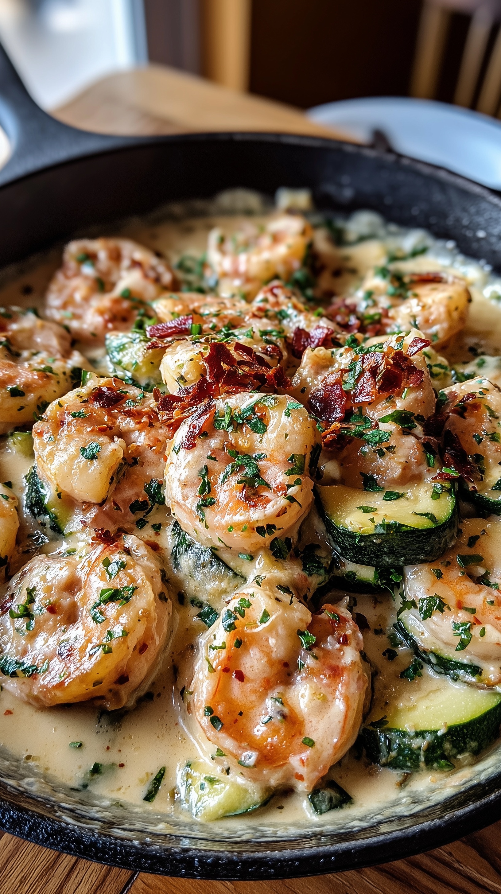
Surface as Story: The Cast Iron and Oak Decision
Food exists in context, and that context carries information. The original prompt specifies "weathered black cast iron skillet with visible seasoning texture" and "reclaimed oak wooden surface with natural grain patterns." These aren't arbitrary rustic aesthetic choices. They're technical solutions to a rendering problem.
Smooth, manufactured surfaces—white ceramic, stainless steel, polished granite—provide insufficient visual texture for the AI to anchor its rendering. Without surface detail, the model interpolates, often producing the plastic-like uniformity that distinguishes artificial food photography. Cast iron and reclaimed oak specify surfaces with inherent variation: the seasoning patterns on iron, the grain and wear marks on wood. These textures give the model concrete data to render, breaking the symmetry that reads as synthetic.
The color interaction serves functional purposes as well. The charcoal black of seasoned iron provides maximum contrast against the warm color palette of the food—coral shrimp, cream sauce, golden sear marks. This contrast operates in both luminance and chroma dimensions, making the food appear to advance visually from its container. The warm oak extends the color temperature of the food into the surrounding environment, creating chromatic harmony that feels intentional rather than arbitrary.
The "reclaimed" specification deserves particular attention. New wood has uniform color and minimal surface character. Reclaimed wood carries the accumulated marks of use—scratches, stains, wear patterns—that signal authenticity. The AI interprets these specifications as permission to introduce imperfection, which paradoxically increases perceived realism. Perfect surfaces trigger uncanny valley responses; slightly imperfect surfaces read as photographed rather than generated.
The Cream Sauce Problem: Rendering Translucency and Volume
Liquid and semi-liquid foods present unique challenges in generative imaging. The cream sauce in this image must simultaneously read as viscous (holding shape on the spoon and shrimp) and fluid (pooling naturally in the skillet). Achieving this requires specific surface description.
The prompt specifies "luxurious velvety cream sauce" and "flecked with fresh chopped parsley." These work together: the velvety texture implies a stable emulsion with surface tension sufficient to create soft peaks and valleys, while the parsley flecks provide scale reference and break the surface uniformity that would read as paint rather than food. The "flecked" distribution matters—too regular and it appears patterned; too random and it appears careless. The AI interprets "flecked" as moderate density with natural clustering.
Light interaction with cream sauce requires careful specification. Cream is translucent at thin edges and opaque at volume, creating complex subsurface scattering. The "soft diffused morning light" provides the gradual tonal transitions that reveal this translucency. Hard light would create specular highlights that obscure the sauce's actual color and texture. The "subtle rim lighting on sauce droplets" specification ensures the AI renders the meniscus—the curved surface where liquid meets air—that signals viscosity and freshness.
The steam specification ("steam wisps rising") operates on similar principles. Steam indicates temperature differential between food and environment, which the viewer interprets as freshness and immediacy. However, steam must be rendered at correct density: too heavy and it obscures the food; too light and it disappears. "Wisps" specifies thin, rising columns rather than atmospheric fog. The directional cue ("rising") provides the vertical motion lines that contrast with the horizontal composition, creating dynamic tension.
Depth of Field as Editorial Decision
The shallow depth of field specification carries more information than simple focus selection. In physical photography, aperture choice determines not only what's sharp but how the transition to blur occurs—the "bokeh" character. The prompt specifies "razor-sharp focus on foreground shrimp" and "creamy bokeh melting into warm amber background hints."
This creates a specific viewing hierarchy. The foreground shrimp receives full attention through sharp detail; the immediate surrounding sauce and zucchini receives partial attention through adjacent focus; the background recedes into color and tone without competing detail. This mimics how human vision actually operates—our eyes scan, fixate, and process sequentially, not simultaneously.
The "warm amber background hints" specification prevents the common error of neutral gray or cool background blur. Background color influences perceived food color through simultaneous contrast. A cool background would make the warm food appear artificially orange; a neutral background flattens the chromatic depth. Warm amber extends the food's color environment, creating coherence.
The f/5.6 specification (implied by the lens and effect description) represents a practical compromise. Macro lenses at minimum focus distance produce extremely shallow depth of field even at moderate apertures. f/5.6 yields approximately 2-3cm of acceptable sharpness at food-typical distances—sufficient for the hero element and immediate context without requiring focus stacking or artificial sharpening. The AI uses this parameter to calculate blur circle size and transition gradients.
Conclusion
Effective food photography—whether captured or generated—operates on principles established through decades of editorial and commercial practice. The techniques aren't arbitrary stylistic choices but responses to how human perception processes food information. The 45-degree angle, the 100mm macro perspective, the directional soft light, the textured surfaces, and the controlled depth of field each serve specific communicative functions. Understanding these functions allows deliberate construction of appetite-triggering imagery rather than hopeful accident. The prompt that results from this understanding contains no wasted words—each specification addresses a particular rendering decision that would otherwise default to undifferentiated, unappetizing generality.
Label: Product
Key Principle: Specify the complete light source—direction, quality, and color temperature—rather than mood words. The AI renders photons, not emotions.